HOME | DD
 1ALPHA1 — MIASMA

Published: 2006-01-18 02:55:26 +0000 UTC; Views: 2596; Favourites: 42; Downloads: 285
Redirect to original
Description
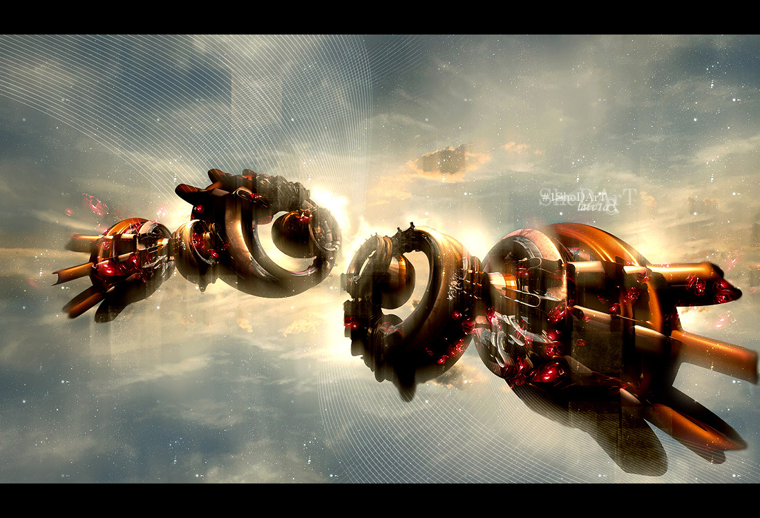
MIASMA : A noxious atmosphere or influence :.....pscs2/c4d..

Related content




Comments: 55

not a very common word but fit for a title.
👍: 0 ⏩: 0


COOOOooooooL colors, and shapes, and, coooooooool.....
👍: 0 ⏩: 1

Crazy render and nice depth to this piece. I like the colors and brushwork. keep at it man.
👍: 0 ⏩: 1

wow man, youre definately getting a lot better!
👍: 0 ⏩: 1
appreciate it, im trying.. lol
👍: 0 ⏩: 0


Ahhh shyte.. nice work yet again homie.
-Sniff, sniff- I smell another collabo brewing.

👍: 0 ⏩: 1
oh hells yeah its brewing, im putting you on the list! lol.. thnx agian homie..
👍: 0 ⏩: 0


The best abstract ive seen in a week or two...
color is brilliant and the shapes are very trippy.
good stuff
👍: 0 ⏩: 1
ahh thnx, im all over the place with coloring, lol.
👍: 0 ⏩: 0
The best abstract ive seen in a week or two...
color is brilliant and the shapes are very trippy.
good stuff
👍: 0 ⏩: 0

damn again some kickass render
The lighting could be better
still nice though
👍: 0 ⏩: 1
thnx, i liked it it dark but maybe i could of brightened it up a bit..
👍: 0 ⏩: 0


Aight home boi
because you wont except the crit on msn
ill jus say this
I HATE IT SO DAMN MUCH
haha playin
The entire peice is awsome
great job on the backround and the render.
the lighting of the peice is awsome except the lighting effects you put on it... if that makes any sense ... the bottom is too dark.
the entire peice is awsome tho great job on the post work i love it
i would fave it twice but i think that would be a problem
👍: 0 ⏩: 1
thnx and good looking out..
👍: 0 ⏩: 1

Very nice work. It almost looks like it was painted in Photoshop. Good colours, good typo, awesome render and ps work.
👍: 0 ⏩: 1

thnx dude, i didnt wanna over kill it..
👍: 0 ⏩: 0


👍: 0 ⏩: 1


dude that looks awesome. very nice render, if the bottom was more like the top then it would look a whole lot better just have it darker at the bottom, so u can clone it a bit if u need to make it look better. think u can do more wiht it though. so make it look like its diving into the water, with bubbles surrounding it. this is still a very nice job, jsut trying to look at it from a different prespective 
👍: 0 ⏩: 1
| Next =>