HOME | DD
 2mo —
inside(me)
2mo —
inside(me)

Published: 2001-10-22 15:31:10 +0000 UTC; Views: 18676; Favourites: 48; Downloads: 6325
Redirect to original
Description
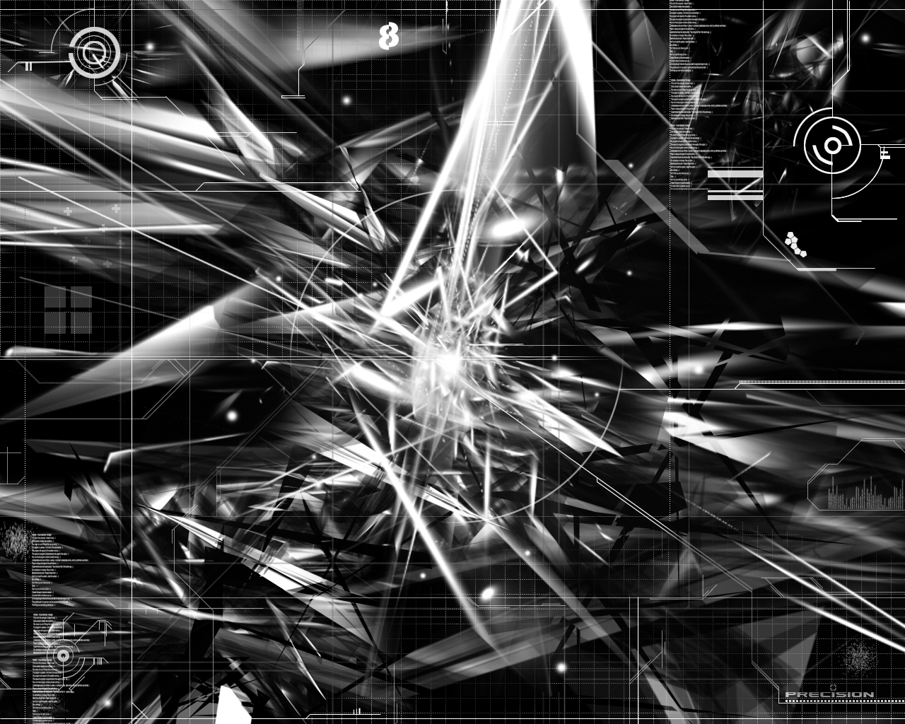
inside me is chaos.This piece took me about 4 days, 3d stuff,
photoshop editing, 3d stuff, typography stuff, touching it up,
done.
Tell me what you think.
oh and
Thanks for the Award!
Related content



Comments: 102


whoa.. great work... I love how it fits togther perfectly... great blending... +favs
-----
BIN LADEN SUCKS [link]
👍: 0 ⏩: 0

Great work
-----
----------------------------------
Come check out my graphics at [link]
👍: 0 ⏩: 0

fig90)( 98 8 5 42 4@ $%^&* 700%# !@#$%^&* U*GSRDnnn [ddd
asdf
et
64-00#$^%&*()_ )_( )* ^%&68ns9ds @#$%^& ---- Oh god, I drop bear on my tastature. Pic is perfect!
-----
RooT OuT
👍: 0 ⏩: 0

loox good, i dont like the size of the arrow tho, it could deff be smaller and give the same effect
-----
wanna thank me for commenting on your work? do something 20x more helpful and comment on something of mine!! o.0-xO[mesh]Ox.-0.o d
[link] > check out my nifty doo zads :-P
👍: 0 ⏩: 0


speechless,
goes..
into..
my..
favorites!
-----
[::. want to see artwork from a 14yo? https://renoud.deviantart.com .::]
👍: 0 ⏩: 0

chaotically awesome
-----
~spectracide
https://spectracide.deviantart.com
👍: 0 ⏩: 0

damn awsome shit
-----
-------------------------------------
up..
👍: 0 ⏩: 0

The chaos is incredibly done well. I dislike the lack of colour, but you obviously had done it for a reason.
The typography, as small as it is I like the most, really adds some focal to the whole wall, though I doubt many would think so.
👍: 0 ⏩: 0

christ that's damn nice...
~ Black Ice
CrazysunART - http://crazysunart.narod.ru
Dominion Staff (Bloke) - telnet://dominion.net.uk:2468
Pop in some time
👍: 0 ⏩: 0

EEEK!! thats cool!!! *light headed*
Put a helmet on that soldier!!
-=[Nitsuj-EX]=-
👍: 0 ⏩: 0

friggin amazing, i love the whole photo manip with the addition of the trendiness, i love it all minus the scan lines on the middle right..nice job, keep it up
👍: 0 ⏩: 0

been very busy man, sorry it's late, but i gotta hand it to you, this is amazing.
https://zep.deviantart.com (¯`·.¸¸.-Take me by the wrist.¸¸.·´¯) https://zep.deviantart.com
👍: 0 ⏩: 0

i'm so friggin sorry that i don't pay attention to the daily's anymore and i'm so sorry i missed this till now. this is amazing. i'm seeing a lot of things in it that i'm not sure you put in there.. you know.. something like an ink blot thing. but nvm that. this really is fuckin good.
...........................
:::KwanStudios:::
· Defining creativity ·
- www.kwanstudios.com -
- malaysia@kwanstudios.com -
👍: 0 ⏩: 0

I don't need to say much for this, because it tells it all, just put it this way FUCKING BAD ASS!
👍: 0 ⏩: 0


Very chaotic. Very nice. I'd have to agree with mantik though. Remove the arrow and it would be better (in my opinion).
[Bok¹³]
👍: 0 ⏩: 0

Wow! I wish I could do that. Very creative and nice work.
👍: 0 ⏩: 0

Great piece! but that arrow gets in the way to me, take that out and it'd be SOLID. Lots goin' on in here, well executed.
I'm with Doja on this too hehe.
.RA
h:media http://www.hypertron.org
un:realism http://www.unrealism.net
i:industrial http://www.ingen.nu
[a:form]
👍: 0 ⏩: 0

congrats! must be gratifying to get dd after all the work. i especially like the subdued almost black colour you've used. it really sets the intense mood.
:: paroxysm ::
Visit the Hub of Creativity
http://www.digitexturia.com/
👍: 0 ⏩: 0


this 0wns i like tha colors and all tha detail an business of this
👍: 0 ⏩: 0

whoa! a DD, you're too cool. a DP and now a DD. i have to get your autograph!
👍: 0 ⏩: 0


One of those to table 13 please...
The image is incredible. Downloading in progress!
👍: 0 ⏩: 0

pretty nice.
___________
I eated the purple berries!! uhh, owww. They taste like... BURNING!!! -Ralph
👍: 0 ⏩: 0

SEE I TOLD YOU!!!! Look at the 20th post
You want fiber, Go eat a sweater
-C3D
👍: 0 ⏩: 0

Ah.. congratulations man, i was fortunate to comment on this before it recieved DD
Anyways, this is still good looking man, keep up the good work!
____// necron
digital.imag ery
http://necron.plastiqueweb.com/
👍: 0 ⏩: 0

very nice, I like the text the best. keep up the good work man!
👍: 0 ⏩: 0

Not bad not bad at all, but if i hear another "Oh gee I wish i could do that!" i'll sock the closest person to me in the face.
Just like clockwork.
👍: 0 ⏩: 0

nice job man. great wallpaper. Im switching to it right now. Thats how good it is.
👍: 0 ⏩: 0

amazing! good flow and great details on it! the typoart's well done! the colors are nice too, love it! DD-indeed!
👍: 0 ⏩: 0

awesome work with great amount of detail, typo-style;
congrats on dd;
dr0n99
👍: 0 ⏩: 0

Awesome work. That indeed is an excellent way of depicting yourself. If I had the skill, I would have depicted my self with a similar imagery. Excellent, excellent. Congratulations on the DD, which is well-deserved. I hope you keep up your excellent work--wallpaper and otherwise.
👍: 0 ⏩: 0

wow
black & white is good
~~me always
web - http://www.bowmanz.com/rebecca
👍: 0 ⏩: 0

btw, i dont see typography here, lol
...
... ... ...
...
...
...
...
...
...
...
... ... ...
...
...
...
...
...
...
...
Head of OPTICO
From The Eye To The Brain
http://www.optico.f2s.com
👍: 0 ⏩: 0
dope! amazing colors! i like the contrast, the details, all those textures and stuff you got there inside, nice vibes, i like the techincal side that it got on top of it with lines and numbers though it manipulation beneath that looks somewhat technical, great work!!
...
... ... ...
...
...
...
...
...
...
...
... ... ...
...
...
...
...
...
...
...
Head of OPTICO
From The Eye To The Brain
http://www.optico.f2s.com
👍: 0 ⏩: 0

chaotic yet beautiful! nice use of monotone as well - i like that in a wallpaper.
º¤~tùñä~¤º
👍: 0 ⏩: 0


very good work just a bit overwhelming...
::itirep:: ::art for the slightly odd::
👍: 0 ⏩: 0

hehe keeen bean!!!
If ThE wOrLd FuCkS yOu,
FuCk It BaCk!
👍: 0 ⏩: 0
hehe keeen bean!!!
If ThE wOrLd FuCkS yOu,
FuCk It BaCk!
👍: 0 ⏩: 0


hmmmmmm
nice piece man..... details are lost in the thumbnail, i can appreciate your work @ full view...... very good, very complex image......
well done
:: ::ekud::
::
:::deviantMAG staff:::
👍: 0 ⏩: 0
woah, when are you ever gonna give newbies a chance? awesome piece.....luvvin it! ciao
frenchie
If ThE wOrLd FuCkS yOu,
FuCk It BaCk!
👍: 0 ⏩: 0

all i can say is one word
thisisonefuckentripoutandcrazylookingwal lpaper
The Darkest Realms Exist Within The Brightest Minds.
👍: 0 ⏩: 0

I thought I had already commented on this........Oh well, I'll just have to comment now... This is another showing of your vast talent... I love how everything blends together perfectly... The color you use is gentle to the eye even though it's bright and dark... Excellent Wallpaper... Truly deserving of the Daily. . .
Stay Deviant!!!
A few examples of my art:
https://www.deviantart.com/deviation.php? id=83992 Under The Eyes Of Heaven (WP)
https://www.deviantart.com/deviation.php? id=85766 Through Hell To Find Heaven (Poem)
https://www.deviantart.com/deviation.php? id=79214 Alien Abstract (Indyart)
https://www.deviantart.com/deviation.php? id=32619 Ode To Chocolate (Poem)
Jokerman https://jokerman.deviantart.com/
I AM SOFA KING WE TALL DID!!!
👍: 0 ⏩: 0

(hahaaa! twee hollanders in vier dagen!).
congrats man, on an excellent piece. i esp like the topographical feel of this one.
👍: 0 ⏩: 0
| Next =>