HOME | DD
 abstract-deviant — Thin

Published: 2006-01-05 04:56:03 +0000 UTC; Views: 155; Favourites: 0; Downloads: 33
Redirect to original
Description
Comments?Related content




Comments: 10


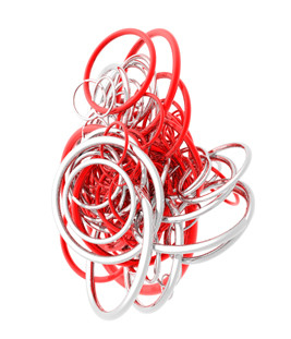
I like the red, but it just seems so... solid. Like there should be more contrast to make it more eye catching
👍: 0 ⏩: 1


ooooooooooh i like it. very nice, i love the reds, but i think it should imply more feeling, and somewhat show it....make it have an angry tone or something......
👍: 0 ⏩: 1

hmmmm...maybeeeee, not a bad idea.
👍: 0 ⏩: 0