HOME | DD
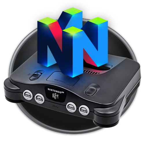
 Anarkhya — Project 64 for N64 emulator
by-nc-sa
Anarkhya — Project 64 for N64 emulator
by-nc-sa

Published: 2007-02-25 17:45:32 +0000 UTC; Views: 8146; Favourites: 10; Downloads: 1983
Redirect to original
Description
** UPDATED ** 18/09/2007_______________
requested by Yabbus23 , hope u'll enjoy!
_________________________________
Project64 seems to be one of the most efficient emulators for Nintendo 64 so here is a Dock Icon for this emu.
--------------------------
Made with The Gimp.
Related content










Comments: 13

Thank you so much for the Project64k high-res dock icon. Just what I was looking for. 

👍: 0 ⏩: 1

It seems that many fellows choosed this icon too, I'm still a bit puzzled as for why this one seems to get so much attention, I may never know.
Thanks anyway and the work will certainly continue (;
👍: 0 ⏩: 0
ouch! an .ico straight from this png icon will look like a tiny pixel soup... are you sure you want this happen?
👍: 0 ⏩: 1

mm don't worry about it I already created the ico lol. It works in all display sizes. I can probably throw it on my page if you want.
👍: 0 ⏩: 1
working at all display size? well show me this .ico, please!
👍: 0 ⏩: 1
Well ok this is more or less what I had in mind when talking about pixel soup. As you can see, [link] this ico is only 50% readable. Especially The 3 smallest sizes that doesn't show well. to fix this would require me to do a specific redesign of these small versions...
You can delete your deviation now
👍: 0 ⏩: 1

The controller is a pretty good idea for the icon. In addition...the icon looks very nice and clean!
However, except for vista users with massive icons, the practical size of icons means that the text on the icon itself is impractical. So while the N64 controller itself is really nice, the text doesn't do much other than get in the way of the icon.
👍: 0 ⏩: 1
Thanx for the comment!
I see your point but I'm targeting dock bar users (winXP) as well as vista ones and linux ones.
More recently I had feedback from frontend multi-emus users who found usage for this size.
standard icons (32x32/48x48) users won't be satisfied with the sizes I'm producing...
👍: 0 ⏩: 0

all you have to do is :
1- Read tutos
2- Training
3- Training
And training ^^
👍: 0 ⏩: 0