HOME | DD
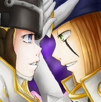
 ashflura — W I N D W A R R I O R S

Published: 2011-04-15 07:42:02 +0000 UTC; Views: 11674; Favourites: 389; Downloads: 201
Redirect to original
Description
Another Theme Crossed off the list.When I see these I just feel relaxed for some reason it might be the colours. Anyway I'm really proud how this peace turned out, the soft shading was good practice and felt like I've improved...something's ticking me off about Fairymon but I'm happy with how Shutumon turned out.
EDIT: It seems a few people are getting confused with the english and japanese names so just stating it Fairymon/Kazemon and Shutumon/ Zephyrmon. One is the original japanese name while the dub name was changed for some reason.
Fairymon, Shutumon belong to Toei, Bandai.
Related content






Comments: 70

omg, I love it !
The coloring is amazing ^^ and Fairymon is pretty, so happy ! XD
Nice work 
👍: 0 ⏩: 1

Fairymon is surprisingly happy!XD Thanks
👍: 0 ⏩: 1
thsts why I like her
You are welcome

👍: 0 ⏩: 0

Somehow... Fairymon looks... scary?
👍: 0 ⏩: 1

By the way, Kazemon looks fine, so don't worry about it.

👍: 0 ⏩: 1
It's just my mind I guess.
👍: 0 ⏩: 1
Yeah, it is. You know what they say, "You are your worst critic."
👍: 0 ⏩: 1
Zephyrmon's eye is a teeny tiny bit off, but other than that...this is one, freakin' awesome fanart!

👍: 0 ⏩: 1
Zephyrmon's eyes are different to the usual Digimon ones, so I can understand why!

👍: 0 ⏩: 1
You drew her eyes a little bit too big because the pointed tip part was too close to the outline of her nose. The shape isn't that bad.
👍: 0 ⏩: 1


You're right... The colors used to be the moody part of an artwork... And it depends on how you used it
👍: 0 ⏩: 1