HOME | DD
 basic1one — reBIRTH U N B L U R R E D

Published: 2002-08-15 03:58:26 +0000 UTC; Views: 145; Favourites: 1; Downloads: 6
Redirect to original
Description
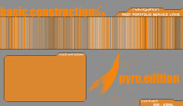
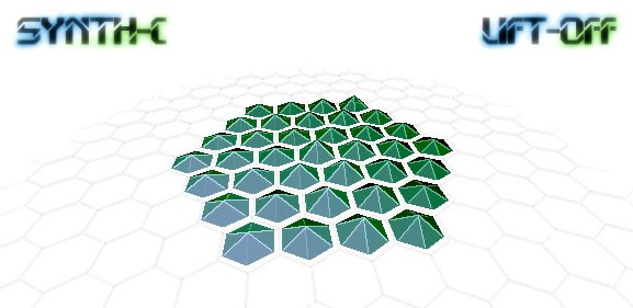
i took it to the head default, i took out the texture.let me know what U think.
basicCONSTRUCTIONdesign
Related content





Comments: 5

jesus, ur gonna make me cry down here man. bah...ur the first so oHwell
👍: 0 ⏩: 0

here goes..
the shadow in the back looks off to me, almost cheesy id say. the dots could use some more work just be taken out, because they just look so randomly placed. your symbol on the bottom-left needs to be smaller. i dont really
like it. i think the bottom half of the form looks better than the top half. but aside from all that i do like the colors.
this was just IMHO take it or leave it. but hey you asked for that right? just trying to give some constructive criticism.
👍: 0 ⏩: 0


i like it alot but it looks like there is missing something somwhere but i really don't know...i still like the wayn it is
👍: 0 ⏩: 0

This is awesome! much better.. I love detail.. and that cloud effect on the last one kinda blurred some of it out.
👍: 0 ⏩: 0