HOME | DD
 blastafuzix — FORCE FEED-VECTOR

Published: 2002-03-16 07:39:08 +0000 UTC; Views: 8413; Favourites: 6; Downloads: 117
Redirect to original
Description
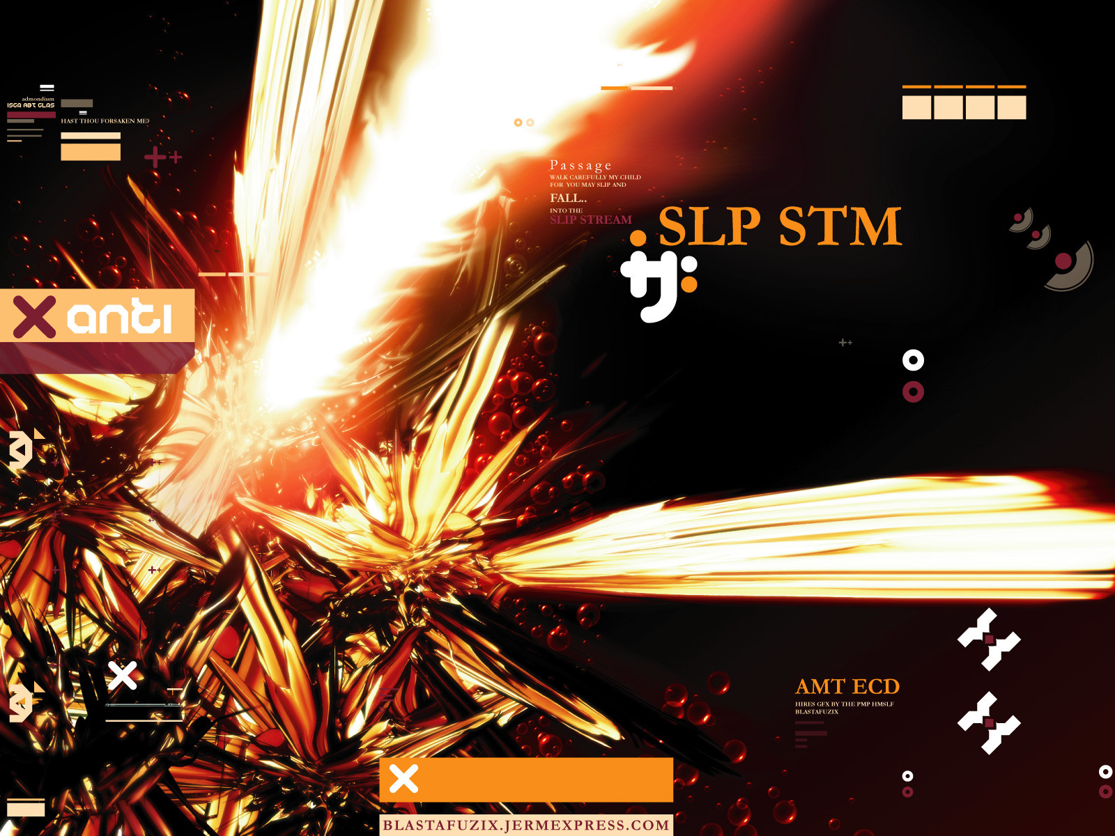
FORCE.FEED : VECTORAfter making a version in photoshop i decided, what the hell, let me try making a version 'ALL IN ILLUSTRATOR' heheh. This is what came about after a few versions, does it suck? what you think i can do to make it better? You can see more detail in HiRES version
Just trying new ideas and trying to be different
Comments? Critiques?
"FREE EXPRESSION"
Keep up the skillz, later
Related content





Comments: 13


theres no wy that cluttered work is bad, this is jsut superb mate, the whole picture takes you in and spits you out in a vectorised fury (rather poetic of me :S). But yeah this is excellent work, and as someone else said it's far from sucking, its good to experiment and i honestly think your onto a winenr with this one.
👍: 0 ⏩: 0

someone said it was cluttered, and this was bad for design...
are you saying that design can't be cluttered?
sometimes cluttering things can provide constrast, can't it?
this thing looks awesome dude. good job.
👍: 0 ⏩: 0

yea, i like it, its got lots of detail and it fills every inch of CD cover
👍: 0 ⏩: 0

its very nice___ but way to cluttered which makes for bad design, you have alot of on point ideas they jus need to be finalized and maybe drugg out into a theme of some sort___ i really like the small detail, like lil objects, squares etc__________+
-----
___________________+
👍: 0 ⏩: 0

Jeez. Once again, great detail. And oh-so wonderfully trendy. Melikes.
👍: 0 ⏩: 0

Mmm... very sexy vector work.. the detail astounds me.
-----
+Sometimes Its Story Time+
👍: 0 ⏩: 0


ahhhh awosme diesgn
-----
-------------------------------------
up..
👍: 0 ⏩: 0

This is pretty cool looking. Hmmm. I am not liking the white fading bar things. Im also a bit curious what it would look like if you removed some of the squares from the right hand shape thing. The lightest color of them image. Does that make any sense? Hope so. Very nice work.
-----
+Icon Deviance+
+Originality through supposed normality+
👍: 0 ⏩: 0

uhh yeah, that is FAR from sucking--it looks totally awesome--love the light shining over it, love it!!
👍: 0 ⏩: 0

Very interesting, I like the symbols and shapes. Nice style.
👍: 0 ⏩: 0

~ that's really NOT sucking actually. this has great detail - but i wonder if the title font should be in a different colour to make it stand out more - and yet i saw it plain enough, it just seems a bit lost. nice one!
-----
no [link]. please review the DeviantArt application.
👍: 0 ⏩: 0