HOME | DD
 blurokr — Google+ VS for WindowsXP
by-nc-sa
blurokr — Google+ VS for WindowsXP
by-nc-sa
Published: 2011-10-29 22:20:17 +0000 UTC; Views: 52893; Favourites: 132; Downloads: 22492
Redirect to original
Description
! UPDATE: +20.000 DOWNLOADS! THANKS AGAIN EVERYONE!!!! UPDATE: NEW VERSION RELEASED! fav.me/d5vtfs0
! UPDATE: +15.000 DOWNLOADS! THANKS EVERYONE!!!

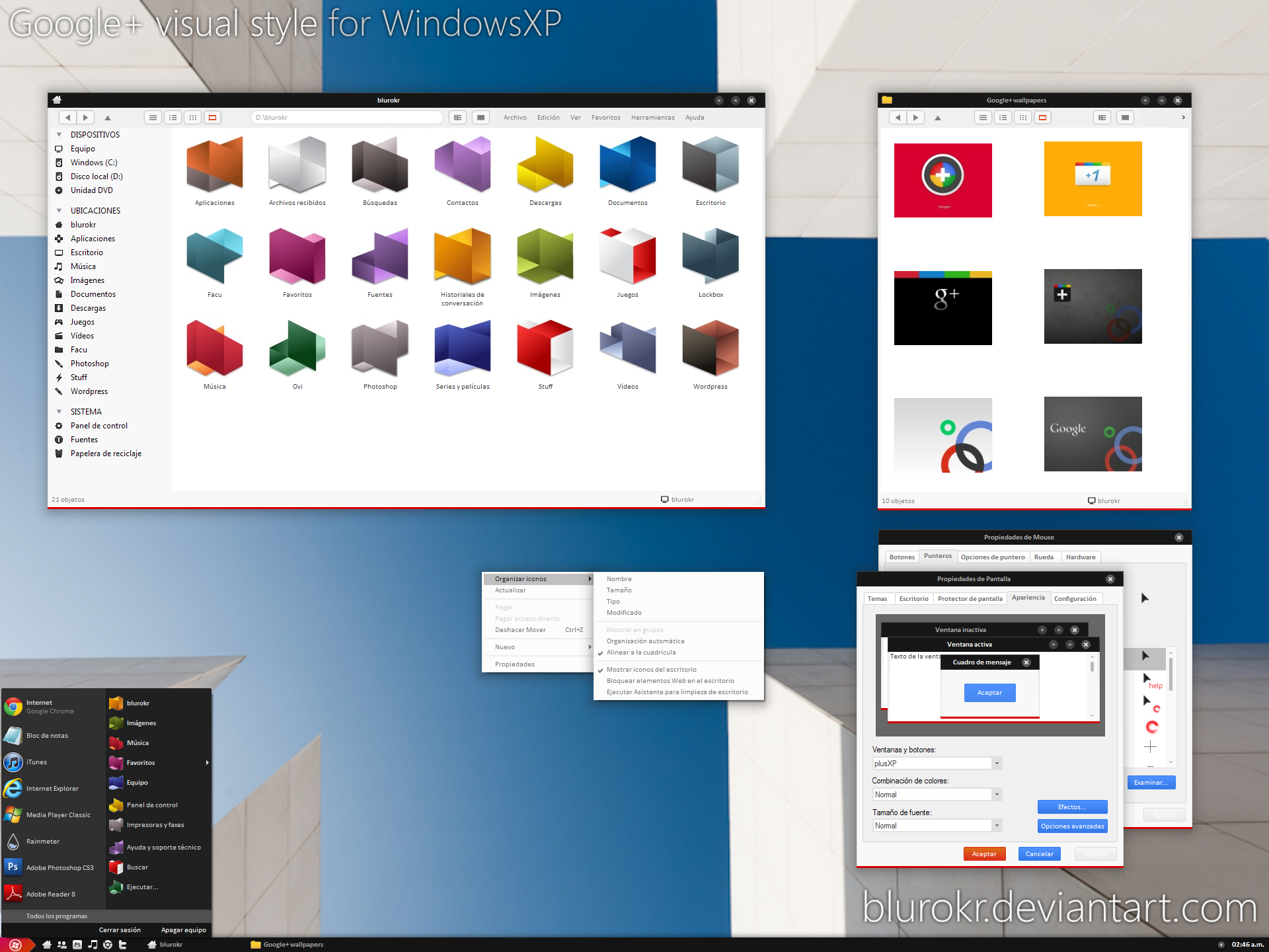
As i said in my journal, i went nuts looking for a google+ish style for xp... i found some great styles in the way, but not THE one, so i made my own! Here is plusXP, a Google+ Style for Windows XP users.
NOTE: As you may see, i'm using Findexer toolbar tomseffect.com/LessClix/FindeX… . The VS doesn't actually have a matching folder sidebar, but aside that, the whole style makes perfect sense. So i recommend installing Findexer, windows are way more useful that way, and you'll get rid of the annoying blue sidebar you'll get if not using it. The next version of the vs (coming soon, I PROMISE!) will have that fixed.
What's inside the package:
- fonts
- vs
- styler toolbar
What's not inside package:
- wallpapers
- icons
- cursors
Let's give some credits now.
· plusXP vs is actually a mod of awesome Iboga VS fav.me/d1ym9ng by TheSmurth
· plusXP toolbar is a mod of Snohseo toolbar fav.me/d2lz8cv by DM-moinmoin
· Cursors in the preview are Dark G09 fav.me/d2lg1my by haydenkeller
· Those incredible colorful icons in the preview are Origami fav.me/d36oexo by nokari
· Small taskbar and findexer icons are Token icons fav.me/d24gow2 by brsev
· Walls in the preview can be found browsing these deviants' galleries:
- TheDeletedUser
- Rahul964
- MetroUI
- diorgn
- rikulu
- f0xt3r
- and sooo many more.
Enjoy!
Related content






Comments: 72


I applied the theme, and t was really good one, but bro it still needs some working to be done. It is not yet perfect one.
👍: 0 ⏩: 1

Hey, thanks! yeah, it was my first theme (and second-to-last actually) and of course it has some issues... minor ones i think, but it definitely has them. It's been out there for quite a while, and i don't think it'll get another update. However you may want to check United Colors, my other vs based on this one, it has some bug fixes and corrections, maybe you'll find a better option there
👍: 1 ⏩: 1

You may think there's no point replying a comment from a deleted account, but i think there is, because the one that made that comment may still be on da with a different account, or even he/she isn't, it'd be a disrespect no to answer him/her. That being said...
Thanks for your critique. I hope you took the time trying the vs before making your judgement. But anyway, i'd love to hear your suggestions and a full critique, so i can keep that in mind with my future works. Greetings from Argentina.
👍: 1 ⏩: 1

Dejalo, Siempre existen estas clases de tipos por estos lares...
👍: 0 ⏩: 0


I surely would, if I was using XP.
👍: 0 ⏩: 0


thanks! it has some minor bugs, but they'll be fixed soon. stay tuned!
👍: 0 ⏩: 0


AAAMMMMMAAAZZZZZIIIIINNNNNNNNNNNNNNNNNGGGGGGGGGGGGGG !!!!!!!!!!
THXX AND GOOD JOB !!!
👍: 0 ⏩: 1
thank you! hope u like and enjoy using it
👍: 0 ⏩: 0

thanks! i'm thinking about version 2 of this vs... no longer google+ vs, but something similar. stay tuned!
👍: 0 ⏩: 1


for 7? i didn't make any theme for 7! LOL thanks anyway! I might be one of the last old-fashioned guys using XP
👍: 0 ⏩: 0


thanks! i'll start working on new version after my final exams... coming soon!
👍: 0 ⏩: 0


se ven mejor la letra quitando el efecto en propiedades de pantalla/apariencia/efectos
"usar el siguiente método para suavizar los bordes de las fuentes de pantalla" desactivado
vi un tema de google plus donde los botones de cerrar, restaurar y minimizar eran los simbolos en colores del google plus pero me temo que era para W7
👍: 0 ⏩: 1
el asunto del suavizado de la tipografía depende mucho del tipo de pantalla... en un monitor LCD seguramente se vea mejor con el suavizado estandar... en un CRT se ve increíblemente mas nítida la tipografía con ClearType activado... en las pantallas de laptops creo que lo mejor es, como dices tu, desactivar el suavizado.
Y con respecto a los botones, los cambiaré en la proxima versión del estilo, pero creo que con el logotipo de G+ en los 3 botones quedaría un poco sobrecargado... pero lo probaré 
👍: 0 ⏩: 0

thanks! version 2.0 coming soon... i think
👍: 0 ⏩: 0

hello!
thank you for your theme, i like it very much .
i setup it follow your illustration.
"Important things to do BEFORE applying the skin:
?You must have your uxtheme.dll patched. If you have it, cool. If you don't, donwload it (see below).
?Install the fonts provided in your fonts folder ["Windows\fonts\"]
?Copy "plusXP" into OS theme folder ["Windows\Resources\Themes"]"
but i cann't see the window like your preview photo .
i don't know the \styler\plusXP toolbar folder set in which folder .
theme\styler\plusXP toolbar or theme\TB\plusXP toolbar or theme\Shell\NormalColor\plusXP toolbar
the plusXP toolbar can't work .
👍: 0 ⏩: 1
hey! first of all, in the preview u see all those huge icons just because i have thumbnails enabled... only Windows Vista & Windows 7 have icons up to 256*256 px... then, the issue with styler toolbar... you must have installed the Styler software. You can get it here [link] if you need detailed instructions to get it work properly, you may see this tutorial [link] Once you've enabled styler toolbar,copy the contents of "plusXP toolbar.rar" in stlyer's skins folder, select it and.. you're done! If you need anything else, please let me know.
👍: 0 ⏩: 0


muchas gracias!! muy pronto se viene la nueva versión!
👍: 0 ⏩: 0

This is great; it's just lacking a fitting shell style. Can I also suggest bigger fonts? Kudos!
👍: 0 ⏩: 1
yes, i didn't pay enough attention to shell.... :S
Thanks for your comment, and thanks for that kudos thing (i googled it) lol
👍: 0 ⏩: 0


i love iboga style, but he had a weighty problem - in some programs check boxes didn't shown as checked, always as unchecked
but in your mode your blue check boxes work fine, thank u for that fix! and i love your blue green and red colors for buttons it's cool!
but red color at the bottom of the window i dont like so much
p.s. animation at taskbar u have not changed ? upheld what was in the iboga ? or u change it?

👍: 0 ⏩: 1
thanks! yeah, i realized about that while building the style. Minor fix actually.
About coloured underlines... i'm thinking about some colour variants for next version, red, blue, green and maybe yellow. And i don't know what animation you're talking about :S
👍: 0 ⏩: 2
yeah, color variants in style it's good, if u do that it will be cool
animation - i show u screen tomorrow
👍: 0 ⏩: 0
btw, there is some other bugs with titlebar buttons in some programs... i'll try to fix it.
👍: 0 ⏩: 0

I like this. Althought the metro start orb is not fitting me to the overall look at all, and the buttons could use some redesigning - making them colorful only on hover/pressed state so they are less distracting.
But like its being said, there was no XP VS that would catch audience for quite some time now. Good job
👍: 0 ⏩: 1
thanks so much... this is the kind of comments that really leads you to keep on making stuff like this. About the buttons, i guess you're talking about those blue and red (and sometimes green) buttons... yeah... they're awfully distracting... i'll keep that on mind on the next version of this vs. Surely, there won't be a green step. Titlebar buttons are most likely to change a little bit... and about the metro orb... yeah, i know it doesn't really match with the overall look, but it's just... i really like it. maybe next vs will have some orb alternatives... or maybe i find a nicer one... or even maybe, i'll get myself to work on one.
👍: 0 ⏩: 1
Its always best to make an orb by your own. I personally think that its the part of VS where you can be wild and use your imagination. Maybe you can take a look and inspire from VS like Area, Amana, Play... some very nice works with orbs there
👍: 0 ⏩: 1
| Next =>