HOME | DD
 CorneliaYoder — UltraFractal 2008 Banner Entry

Published: 2007-11-27 01:52:20 +0000 UTC; Views: 560; Favourites: 9; Downloads: 0
Redirect to original
Description
This is my entry for the Ultra-Fractal Banner contest .Just for fun (UF users), how many different (a) formulas, (b) coloring algorithms, and (c) transformations can you recognize.
Related content


Comments: 18


Congratulations Cornelia on your honourable mention in the UF banner contest - a really beautiful creation! 
👍: 0 ⏩: 1

Congratulations on winning the honourable mention, Cornelia, this is such a beautiful banner! 

👍: 0 ⏩: 1


Thanks, Jurrivortex, you're very kind
👍: 0 ⏩: 0
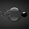

I think the fractal is pretty good. The intricate detail on the left side make a really interesting splash, and I like the light yellow soft lighting effect on the circle. The spiral on the right helps focus attention on the text. However, I don't like the text. It seems too plain for this fractal, and, while the yellow is the same yellow used in the soft light effect, the hard edges of the text makes it so that it doesn't blend well with the rest of the design. The pixelating effect of the jpg compression also makes that edge kind of ragged.
In order to help the text, I would play around with the blending options on the text layer of photoshop, if you have photoshop. If you can get it so that the text looks like it's surrounded by the same soft glow as the circle on the left, and perhaps do a soft emboss to make it look slightly three-d like your fractal, I think it would go a long way to improving the design.
Overall, pretty good. Good luck with the contest!
👍: 0 ⏩: 1
Oh, man, I wish I knew how to do that. I actually did try in Photoshop, but I know almost nothing about how to use it, and I didn't figure out how to do anything with the text that was better than this.
If this entry should win, maybe we should ask the U-F admin if we can make it a joint project
👍: 0 ⏩: 0
Advanced critique... 


👍: 0 ⏩: 1
LOL, nonsense, you should enter, you never know what will spark someone's vote
👍: 0 ⏩: 0

Looks like a winner to me...
Lovely work...
Maybe some cy ucl's...

👍: 0 ⏩: 2
And, no, there is not a single cy formula of any kind in this. It's almost all from standard.
👍: 0 ⏩: 0