HOME | DD
 CrunchNugget — Turning on a Bit

Published: 2011-07-16 02:19:30 +0000 UTC; Views: 6744; Favourites: 229; Downloads: 177
Redirect to original
Description
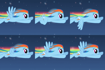
asked me to attempt a picture of Rainbow Dash thrust vectoring, so here's what I came up with. I half-joked that I could have flames shooting from her hooves to simulate jet engines, but he seemed to like the idea of rainbow flames, so I went with it. Should there be some kind of trail coming from those flames?Oh jeez, I just noticed I accidentally made a pun with the deviation title and the requester's name. That's kinda weird.
Anyway, at first I gave her normal wings, but then I decided to experiment with them a little. I wanted it to look like her wings were really catching the air to add to the rapid turn, and I thought it would work better with somewhat more realistic wings. Not sure if they look quite right though; I just couldn't seem to get them to appear to be at the angle I was going for.
Should I have made the rainbow trail slightly different shades? It looks a little weird how it merges with her tail at points. And is that too many sparkles?
This might be too big, I don't know what's best. It's just so easy to make vectors huge.
Aaaahhh!!! This was included in Equestria Daily's Drawfriend #131, as #11! [link] Aaaahhh!!! That's weird. Hmm...that probably means I should make extra effort to make those improvements, now that it's gotten a little more attention. Or does it mean that I should leave it as it is for the sake of continuity, or whatever?
*Edit* Her chin/neck area was bugging me, so I changed it. I think it's a bit better now.
Related content






Comments: 42

Awesome vector. Does look really nice. Is there anyway you could re-size it for desktop wallpaper? If not thats cool
👍: 0 ⏩: 1

I haven't really made wallpapers before, but it should be easy enough to give it a shot.
What resolution did you want? Although it would remove most of the rainbow trail, a simple crop job should work for most sizes. For wider resolutions, I could extend the sky enough to avoid cutting off the tip of her wing or tail. Or did you have something else in mind, like rotating to fit more of it in, or shrinking the whole thing to preserve more of the trail, etc? Several ways it can be done.
👍: 0 ⏩: 1
Thank you! My screen reasolution is 1440 x 900 and i think roatating so it can fit more of it in would be better 
👍: 0 ⏩: 1
Is this about like what you had in mind? [link]
The trail looks a little weird to me angled and cut off like that, but what do you think?
👍: 0 ⏩: 1
Looks pretty good, I can see what you mean by it on an angle, does look a little strange. Do you mind if I see what it looks like cropped? I hope I'm not being too picky. If you don't want to thats cool
👍: 0 ⏩: 1
These are all very simple changes, so it's not any trouble.
Anyway, without the rotation, I have to extend the sky a little, so it takes up a larger portion of the picture. The only other way to get Dash larger would be to either completely redesign her wings and legs, or chop part of them off. [link]
👍: 0 ⏩: 1
Ooh very nice, I really like that, fits really well in the screen. Great job

👍: 0 ⏩: 0


Wonderful design and style you did in this piece.
👍: 0 ⏩: 0

Wow, that's cool, the pose is fantastic for such a difficult manuever to pull off (both artistically, and for Rainbow Dash, actually!) and the realistic wings are an interesting take.
I don't know about the 'rainbow jets' on the front hooves, initially looking at the picture before reading your description, I really didn't know how to read those. Once I saw your idea behind it, it clicked, but initially I was just a big confused by it, still a cool idea.
👍: 0 ⏩: 1
Yeah, the rainbow flames were an interesting concept, but they didn't really work out as well as I'd hoped, at least as they are right now.
👍: 0 ⏩: 0

The why the mane looks is just too epic or words and the sparkles are a very nice touch. Plus, if you had added the fire coming out of her hooves, it would of been a bit much lol. Overall, nice work on this
👍: 0 ⏩: 1
Ah, thanks. I guess that confirms that some of the details I was unsure about really can be mostly just personal opinion.
👍: 0 ⏩: 0

There is no escaping the long eyeballs of EqD! You could always leave this one and upload your newer ones with a link from here.
Congratulations on a Drawfriend entry, even when you really didn't want it.
I've been dreaming of one of my crappy works being included in that since I started drawing ponies.
👍: 0 ⏩: 1
There's a bit of an "Eek! Attention!" factor involved, a la my Fluttershy-y side, but mostly it's kinda neat. It may not be perfect, but I think most of the problems aren't hugely glaring.
I don't know, I might just decide to leave it as is, and just keep its issues in mind for later pictures. Or maybe only a couple very slight tweaks, instead of reworking lots of details. Or I might go through with all those changes anyway. I'm so decisive!
Also, if it means anything, I remember being particularly aware of your submissions during the training grounds, even though I rarely made comments other than "Here's what's wrong with my picture today." and "Crap, I'm so late!" type remarks.
👍: 0 ⏩: 1
It is great just as it stood. I've looked at it several times and it jumps out as a pleasant, fun image just as you drew it. It is only because of what you were striving to make out of it, something dramatic, that I think it could be more inspiring. It is your good work and you certainly deserve to be proud of it.
Did you look at this edit I did?
[link]
Kits really liked the design if you look at the comments, but I think he thought I drew the whole thing. I'll take it down once you tell me to.
It is kind of nice to be noticed, sometimes.
I'm guilty of the same thing. I was so wrapped up in my own little art concerns and garnering "Phoe comments" that I rarely said anything except about exceptional art. The other problem was that there were 200 friggin entries every night!
Well, happy flying!
👍: 0 ⏩: 1
Yeah, I saw your edit, and thought kitsuneymg's comment was amusing.
The trail did look interesting, and makes the whole thing stand out a bit more. The colors you used for the trail make my colors look kind of dull, actually, so maybe I should brighten them up if I do end up making any changes.
Chances are, though, at this point I'll just let it remain what it is. The guy who made the original request never actually said what he thought of the final result, but I have a feeling he's the one who posted it to Ponibooru, so I guess I can take that as approval.
👍: 0 ⏩: 1
Good enough.
That's kind of a sideways compliment for you. I guess it ultimately doesn't matter, but recognition of your effort would have been nice, and to know if he enjoyed the result.
👍: 0 ⏩: 0
Hi, me again. I had an idea that might work. How about a spiraling rainbow trail that is off-center and fades with distance kind of like a balance wheel spring that has been stretched sideways? Sort of like this, [link]
only good and more spirally rainbow.
👍: 0 ⏩: 1
I'll try several things with the trail and see what looks best.
👍: 0 ⏩: 1
Okay, hope it works out for you.
👍: 0 ⏩: 0
One more thing, I think her body position, legs, head tilt, and eye expression are great. If you could get the blue outline of her mane into the purple portion of the rainbow trail that would make it stand out better.
👍: 0 ⏩: 0
doh! I meant the purple portion of her mane
mane melding = "mane from melding"
are on a downstroke rather = "at the bottom of a downstroke"
Sorry, I really should have proofread this before hitting the button.
👍: 0 ⏩: 0
Hi, good stuff here with Dashie, I like this!
Okay, my take. My first impression was that she was falling, I have no feel of a dramatic change of direction more like she is gliding to the right. I don't pick up on "thrust vectoring" from the hooves. I thought they were trailing rainbows as well. I think if you took the trailing rainbow and twisted it, or folded it and/or angled it in from the side, or jagged it in from above as if it were following her jinking you would have a more dramatic composition. I think you can make it work with the same colors, or you might try fading the rainbow as it trails farther from Dashie. I would vote less or no sparkles, but that is just me for this image. I think you are going for dramatic aerodynamics, and the sparkles are to me more like she is magicking her butt through the air.
I find that the blue portion of her mane disturbs the outline of her body. It seems to me as if she has a blanket on her back, or that the bottom of the blue is the outline of her back. I think that tousled mane would look better as if it is caught in the turbulence that would be swirling around her body as it cuts belly-first through the air. That would also keep the colors of her mane melding with the colors of the rainbow.
I would try making the hooves' thrust more like a rocket's thrust plume. A parabolic "dish" of light surrounding the hoof wall, a tapering cone of flame, and maybe a twisty rope of smoke, kind of dim, but something that gives the feeling of a powerful directed blast. The trailing of the rainbow behind her should twist as she rotates around her center of gravity.
Her tail, I think works in the rainbow, but I would try having it at a different angle to the rainbow trail as if she is in the middle of a directional change, like a cheetah whipping its tail as a counterbalance and see if that works at all. If she is thrusting with her forehooves, she will rotate CCW so her tail should go higher, or down if it is a counterbalance. It might screw with the flow you have, but if you are going for a dramatic directional change you are going to have to show it somehow. Right now everything flows too well, nice actually, but not for what you are saying you are trying to convey.
Her wings look like they are on a downstroke rather then catching the wind. I would try foreshortening her wing so it appears as if it is pointing at the viewer more, like a 30 degree angle from horizontal, and "cup" the wing with the feathertips curling upwards as if the wind is rushing by them. I think she has too many feathers, and you could add a shorter inner row of feathers to fill the space and make them look more like the covert feathers of a bird. In the show they are usually shown as 4 primary feathers and 3 coverts, but you could add some for dramatics with no problem, I am sure.
I found that if you Google: "slotted wing soar" under images you get some great wing photos.
👍: 0 ⏩: 1
You caught a lot of the exact issues I had in mind.
The falling thing was one of my biggest concerns from the original pencil drawing I did for this, which is in my scraps. In fact I even described that one as looking like she was doing some kind of diving routine, rather than flying. It's just so hard to create such a complicated action of motion in a single still image. Giving the trail a sharper bend might help, as you say.
Her mane was one of the things that was bugging me too. I tried it a few ways and they all looked a little weird. I had it hidden behind her body at first, but that didn't look right. At this instant in her directional change, maybe it should be flying down or splayed out chaotically instead of still curving up behind her.
Somebody else made the comment that it looks like her hooves are sprouting hair. So while the rainbow flames were a neat idea to try, it probably needs to look like actual fire to work for the over all concept of the picture. And had it been normal flames, I definitely would have added a smoke trail, but it somehow didn't feel right for the rainbow-colored version. I'll have to get the requester's opinion on that, though, since the rainbow flames were his suggestion for my flame idea.
For the tail, I'm not sure. I was visualizing it as though the tail-end of her body hasn't quite finished the shift yet, hence the strong curve in her body. So a moment later, her tail would definitely flick downward, but at this particular instant, I don't think it's reached that point yet. With her body halfway through the turn, I think her tail would be the very last thing to make the change. So yeah, I think it should be curved even more strongly toward her head.
The wing angle concerns are pretty much just what I was thinking. I made about 6 different wing designs in all. I just couldn't get it to look right, though, so I left it in the unsatisfactory pose that's pointing downward too much. I actually did curve the feather-tips a bit, though probably not enough. I winged (pun not really intended) this initial design, then when I wasn't satisfied I tried to find pictures of actual birds in flight, but none of those I saw had the wings at the right perspective, so I just left it.
I'll definitely try out at least some of these changes, but unfortunately it'll probably have to wait a couple days. I haven't even started my poison joke picture for the training grounds alumni group, and it's going to be pretty complicated and will take a while.
👍: 0 ⏩: 1
Yeah, I should have been working on my "Poison Joke" instead of goofing off with your image, but who can resist Dashie?
👍: 0 ⏩: 0
The sparkles were actually the easiest part of the entire picture. Inkscape has a simple feature for adding geometric objects like stars with as many points as you want. So all I do is make a star, give it 8 points, tweak a few of the corners, then use the spray tool to toss out duplicates of varying sizes and rotations.
The fact that it's so simple is why I ended up with probably a few too many.
👍: 0 ⏩: 1

Inkscape? i've never heard of that... Is it like GIMP?
👍: 0 ⏩: 1
It's free like GIMP anyway. It's for making vectors, though, instead of general image editing. [link]
👍: 0 ⏩: 1
Thanks! i will check it out!
👍: 0 ⏩: 0

First of all, awesome picture. Very action-packed.
I would agree with you that it does look a little odd in places where her tail and the rainbow merge. Rather than change the colors on the rainbow, have you considered removing her tail? That would be the first thing I would try, personally.
And I think the bigger wings help give it a sense of power, so good call there. Though yeah, getting wings to look just right is hard. They seem fine to me, though.
👍: 0 ⏩: 1
Hmm, removing her tail...I guess when she did her rainboom as a filly the trail did pretty much come straight off of her, making her tail seem to disappear. I don't know, though, I was kinda counting on the curve and position of her tail as one of the biggest indicators of her trajectory. Pretty easy to test and see how doing that affects the picture, though, so I can give that idea a look.
👍: 0 ⏩: 0

What program do you use for the digital editing?
👍: 0 ⏩: 1
I've been using Inkscape to make my vectors. I probably ought to try doing some coloring and actual shading with GIMP some time too. Seems like it'd be nice to have one of those tablet gadgets for that sort of editing, though.
👍: 0 ⏩: 1
You DON'T use a tablet? Ho-ho-hooooly shit, my friend. That's impressive.
👍: 0 ⏩: 1
Yeah, that's why I pretty much always do a pencil version first, so I at least have a starting point to build my vectors on. Well, that and so I get some actual drawing practice, since the vector process is mostly just dragging nodes around.
👍: 0 ⏩: 1
I know this one nifty tool that just out lines the darkest points according to pressure. Darker lines get darker colors, etc... It's only cruddy because if you make an itsy bitsy little tiny mark, it usually marks THAT too...
👍: 0 ⏩: 1
That sounds like it could be useful, potentially. I tried playing around with Gaussian blur and contrast a couple times for some of my pencil drawings, but it just ends up looking kind of weird. So tracing with vectors has been the only way I've been able to translate a pencil drawing into a version I can color digitally.
👍: 0 ⏩: 1
Yeah, but you have to be UBER careful with it. One mark of an eraser, and it picks it up as a line. It's super sensitive.
👍: 0 ⏩: 0
