HOME | DD
 deepdot — Eternity

Published: 2004-02-29 08:35:51 +0000 UTC; Views: 73; Favourites: 0; Downloads: 10
Redirect to original
Description
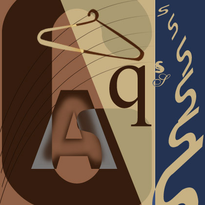
This one has got confusing type forms......though I like the overall piece that it formsRelated content


Comments: 4

This is very nice. (such a weak word..sorry) i like the explosion and the way you have the letters fracturing into view. The silohette is simple but effective. Very good work!!
👍: 0 ⏩: 0

nice graphic, and the type is a bit confusing but i like it, nice design
👍: 0 ⏩: 1

Thanks ........many people found the type confusing........i somehow never corrected it later on.......lazy me......will do it ........promise
👍: 0 ⏩: 1
lol eh if you want to and i know what being lazy feels like especially when something is done in my eyes. i only really change things if its done for someone else like commision and whatever
👍: 0 ⏩: 0