HOME | DD
 deepdot — Type Circus

Published: 2004-04-25 17:59:19 +0000 UTC; Views: 110; Favourites: 0; Downloads: 19
Redirect to original
Description
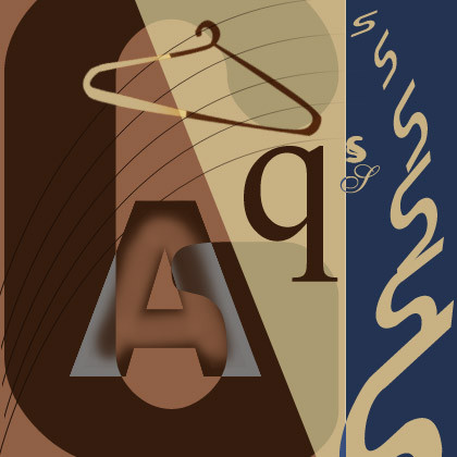
This was made by merging some typography work i did for the kinetic typography assignment.It is sort of like a collage with superimposed pieces of moving type.....which make a nice formation in unison.
Related content


Comments: 5

I really like the way your lettering goes from strong to fade....it's very effective and makes for a very interesting composition. The choice of colour is very restive and easy on the eyes too. It's a quiet piece...and very well done.
👍: 0 ⏩: 1

the reason why the lettering goes from strong to fade is becoz i was doing an assignment on typography and how the blur tool would effect it..........i am glad u liked it.
👍: 0 ⏩: 1

I am fine...........it's been a long time since you wrote to me...........how have things been?.........thanks for the comment.
👍: 0 ⏩: 0