HOME | DD
 digitaldecay — DigitalDecay - Logo v1
Published: 2001-03-14 08:08:16 +0000 UTC; Views: 1213; Favourites: 8; Downloads: 229
Redirect to original
Description
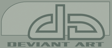
The screenshot is one possibility of this logo. Click [DOWNLOAD] to see a shot that offers slight variations (it will load right in your browser).(*Of course it can be altered, and the DA can be utilized alone.)
Let me know what you think.!
[Note, vectorized file will be supplied if logo is chosen.]
Related content







Comments: 7


Simplicity pays!
What do you think about this one?
https://www.deviantart.com/deviation.php? id=21937
---------
While we are at it could you please give me some feedback on this?
http://www.geocities.com/bounddigital
👍: 0 ⏩: 0

VERY nice. I like it alot. Definitly one of my top 5 favorites. I like the background and all. Great logo man. You've got good chances.
-[ ::db:: ]-
👍: 0 ⏩: 0

thats the best ive seen. though id drop everything but the 'DA' letters to make it even more simple. simplicity hey, shouldve used more of that with my logos. very good work.
👍: 0 ⏩: 0

yes, the screenshot does look odd..
/me hovers mouse over download link
--
samus
idleDesign
inane babble you dont want to hear
--
👍: 0 ⏩: 0

nice looking logo...i love the simplicity!
--[ jark ]--
👍: 0 ⏩: 0

very well done.
all versions look great, though to follow contest rules the last shot in the dload would be the way to go i believe.
👍: 0 ⏩: 0