HOME | DD

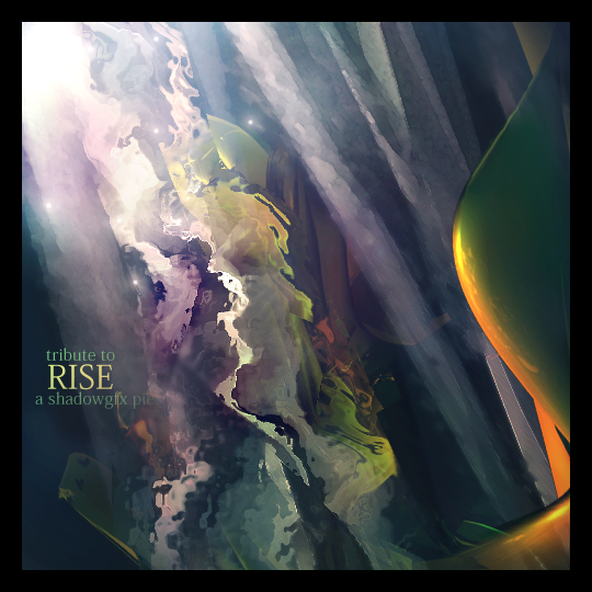
dotshadow — Rise v. 2

Published: 2006-05-26 15:38:21 +0000 UTC; Views: 606; Favourites: 6; Downloads: 178
Redirect to original
Description this took me around 6 hours
photoshop only first version had some c4d in it but it looked bad...

no stock used..
Related content
Comments: 12

rkatzam [2006-10-19 07:54:53 +0000 UTC]

The colors are just magnificent.

👍: 0 ⏩: 0

htdffaf [2006-06-01 16:54:41 +0000 UTC]

do somthing about the text and you will have somthing great on your hands.

👍: 0 ⏩: 0

xRuMpx [2006-05-28 01:43:26 +0000 UTC]

WONDERFUL work, nice color scheme, *applause*

👍: 0 ⏩: 0

FabF [2006-05-27 21:19:39 +0000 UTC]

Great !

👍: 0 ⏩: 0

TLBJohnnyAlpha [2006-05-27 18:23:16 +0000 UTC]

this is the shit, but text hurts it a lil. anyway

👍: 0 ⏩: 0

Telemaster [2006-05-27 13:55:44 +0000 UTC]

definetly cool dude, but the text suck indeed

👍: 0 ⏩: 0

chaooss [2006-05-27 11:49:06 +0000 UTC]

Very nice work indeed....
Just too small size m8...

👍: 0 ⏩: 0

Mr-Magic [2006-05-26 18:31:01 +0000 UTC]

I like the colorin

👍: 0 ⏩: 0

xangfx [2006-05-26 17:33:54 +0000 UTC]

Now its great, you've fixed all wrongs and now its great NIce !

👍: 0 ⏩: 0

iamsansan [2006-05-26 16:21:28 +0000 UTC]

thats cool

👍: 0 ⏩: 0

sFx0r [2006-05-26 15:53:12 +0000 UTC]

deffo improvement on v1, text is better and what u said, looks better without the c4d
faved

👍: 0 ⏩: 0

khorask [2006-05-26 15:49:14 +0000 UTC]

Nice abstract, like the colors

👍: 0 ⏩: 0