HOME | DD
 dpcdpc11 — Simplify Caption Buttons Glyph
by-nc-nd
dpcdpc11 — Simplify Caption Buttons Glyph
by-nc-nd
Published: 2014-01-13 00:01:23 +0000 UTC; Views: 1808; Favourites: 5; Downloads: 18
Redirect to original
Description
The customization bug has bit me again!I finally used UxStyle on my Windows 8 installation.
For now it's all good, not system crash or black screen loops. Hope it'll stay that way.
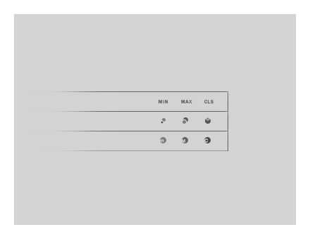
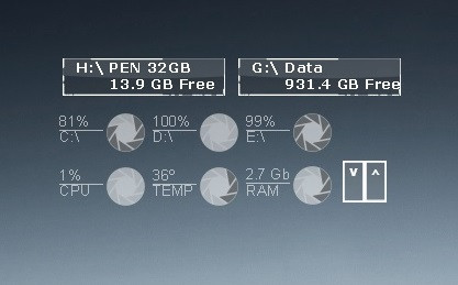
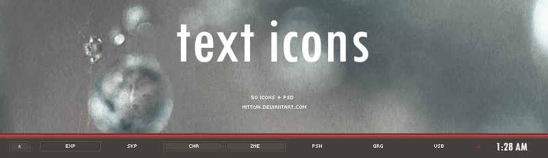
So I started to port my old theme Simplify Slim to Windows 8 and in the process I made some new variations for the min, max and close caption buttons glyph.
Which one do you like most?
Related content








Comments: 13

The last one is cool when it comes to the concept, but I guess it's not intuitive enough (especially for users in non-Latin alphabet regions). The one with the circles is looking great - I'd add some kind of crop circle (you know, made by the aliens 
👍: 0 ⏩: 1

yeah yeah... the one with the circles kinda resembles the crop circles.
👍: 0 ⏩: 0

, so you‘re porting it. Such great news!
I like the most the ones (the old ones) which are shown in the 1st window in the screenshot here: dpcdpc11.deviantart.com/art/Si… .
Talking about these, I like 1st variant the most too.
👍: 0 ⏩: 1
Thanks for the feedback my friend!
👍: 0 ⏩: 1
Wait a minute 
👍: 0 ⏩: 1
right now I'm using another version.. look here snag.gy/HxlmT.jpg
I also liked the 2nd variation the most but I got bored with it so I made these new ones.
The theme is still in Beta and I'm still editing a bit here and there when I have time. Maybe I will release it next month.
Stay tuned!
👍: 0 ⏩: 1
Too simple 
Sure I‘ll stay tuned!
👍: 0 ⏩: 0


The first two are great. I don't like the last one.
👍: 0 ⏩: 1
thanks for the feedback my friend!
👍: 0 ⏩: 1


I like the middle one.. maybe you could enlarge the picture
👍: 0 ⏩: 1
thanks for the feedback! this is the original size of the image and the buttons. They have to fit in this theme dpcdpc11.deviantart.com/art/Si…
Enlarging the image would ruin it.
👍: 0 ⏩: 0