HOME | DD
 DudeNinja44 — 3 PSD File Pack
by-nc-nd
DudeNinja44 — 3 PSD File Pack
by-nc-nd
Published: 2011-03-13 16:36:01 +0000 UTC; Views: 704; Favourites: 0; Downloads: 52
Redirect to original
Description
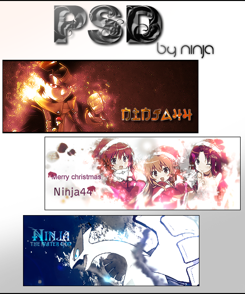
Hey guys this is my second Psd file i hope its better than the last one these sig's are like my favorite sig's.1.First sig
This sig is of Obito from Naruto.I like the glow in right side of Obito's face i had edited the text because the last text didn't seem appealing hope this sig helped you a little.
2.Second sig
This sig was made for Christmas i had entered this sig in a SOTW contest but i had changed the entry and i didn't win if i hadn't changed it i would've won it.
3.Third sig
This is of Lugia from Pokemon.I also used this sig for a SOTW contest and i won i really like this sig and i used displace in it for getting flow.
Hope this Psd pack helped and don't rip or you will have to r.i.p
Related content








Comments: 7


Thanks,and also thank you for downloading.
👍: 0 ⏩: 0

i like the first sig
seems like you need to work on depth and fonts.
on the first sig the fext shouldnt be too big coz it will take away the focus from the render. i guess the font selection is fine but you want people to be able to read it. effects are good but kinda too hard on my eyes.
on the 2nd sig you need to work on font selection. i think you can search "font tutorial". i suggest using the visitor font [link] if you want to put in your name.
on the third sig, you need to work on depth. on a sig you want to create a focus point. usually its a point at the render (example: the head). when you have a focal point, the other parts doesnt really matter. so just put some blurs on them. for this sig, the focal point would be the head. you can blur both the arms of the render. doesnt need to be blurred too much, just enough to get the people's attention to the head.
i guess thats all i have to say. sorry for commenting, just trying to help you get better

👍: 0 ⏩: 1
I made these sig's when i sucked at text.I didn't know anything about depth that time i was a noob that time didn't know much things about sig's but i wish to get better thank you for your feed back.
👍: 0 ⏩: 1
hmm..seems like you still need to work on text. too much text isnt good for the sig. you want them subtle and meaningful.
👍: 0 ⏩: 0