HOME | DD
 ejsing — Freakysign - Design Studio

Published: 2009-12-12 14:17:54 +0000 UTC; Views: 27704; Favourites: 291; Downloads: 1045
Redirect to original
Description
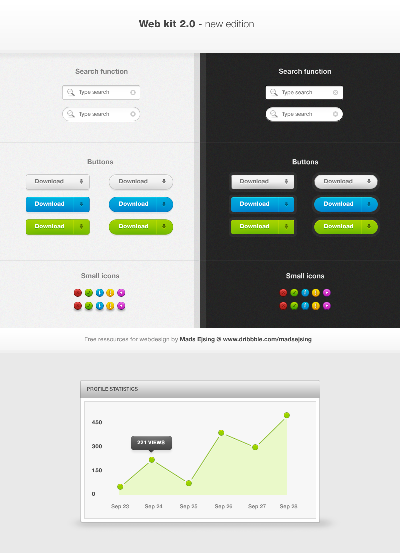
Well, this is one of my favorite designs of mine.Hope you guys like it.

Related content




Comments: 100

Nej, det går nok - sålænge vi snakker idéer. Men jeg vil gerne se resultatet!
👍: 0 ⏩: 1

helt sikket, har set flere designs i samme stilrene stil men synes du rammer en god vinkel med center billedet. Har dog selv lidt i tankerne et mere aflangt design da jeg ska bruge det til et galleri.
👍: 0 ⏩: 0


I would, as someone else mentions, love to see it with a taller footer - and the I think that the "Read more"-buttons should be aligned.
👍: 0 ⏩: 1
The tall footer did not work for me.
I see what you mean about the read more buttons.
👍: 0 ⏩: 0


Great job, I love the minimalism of it.
👍: 0 ⏩: 1

Awesom work buddy
I love the simplicity and colours, it all works really well together.
Only thing is the dark triangle bar stretching across the very top doesn't go all the way to the end
👍: 0 ⏩: 1
Thank you very much.
Oh - I missed that little mistake.
👍: 0 ⏩: 0


Woah I love how clean this design is.
👍: 0 ⏩: 1

Really fine, that turquise looks great in combination with that clear Layout. I think it would look better without that noise effect but I`m not sure
The Footer is too small, really needs to become bigger 
👍: 0 ⏩: 1


Oh my god!
Great layout.Helvetica is my favourite font.
I think is the best font.

👍: 0 ⏩: 1
It's Arial? Oh!
Looks Helvetica.
👍: 0 ⏩: 1

I tried to make it taller, but it ruined the wide-feel.
👍: 0 ⏩: 1


<= Prev |