HOME | DD
 ekud — WICKED ENTERPRISES

Published: 2002-05-02 08:06:43 +0000 UTC; Views: 49003; Favourites: 219; Downloads: 11215
Redirect to original
Description
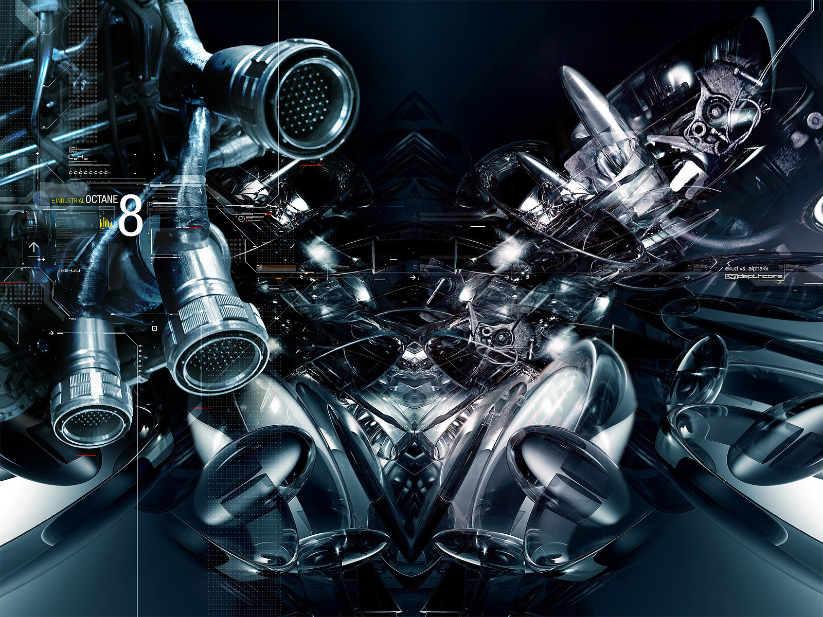
i sat on this piece for about a week, refining the typography and concentrating on its composition.hope you like it.
- jus
Related content


Comments: 180

Bit choppy in certain areas on the lines and text, but I'm loving the composition of the abstract.
👍: 0 ⏩: 0

TOTTALLY COOL AND I ONLY JUST JOINED DEVIANTART AND HOUR AGO!!
👍: 0 ⏩: 0

!!! omg! i found it. after about a year, i found it. *ahemX about a year ago, while searching the web, i stumbled across this piece. i loved it. this piece is the reason im at deviant art now. thank you.
👍: 0 ⏩: 1

you're welcome, but this piece is shit.
👍: 0 ⏩: 0

fucking awesome looking piece you got....love the colors too
👍: 0 ⏩: 0

FANTASTIC 
👍: 0 ⏩: 0

WOW man 
Typo could be better, but wallpaper kicks ass !
👍: 0 ⏩: 0


I really dont like this piece at all. It looks just slapped on top of some stars. The lines stand out way too much and i really dont like the font choice. The brushing isnt that good either
You can do alot beter
👍: 0 ⏩: 1
yeh, look at the date pal, its like a year and a half old. no kidding i can do better.
👍: 0 ⏩: 1
sorry mate, i was directed to this link by some fool @ a forum, thinking it was a recent piece...i have no idea y he sent me an old one
your new stuf is great though
👍: 0 ⏩: 0

Sorry but can see reason why this has got so many favs... Abstract gallery is full of same kind of work with much less favs... everyone don have 950 people watching which I think is main reason for this many favs... This is good for it' s own category and has nice touch but still over 200 favs? maybe there is some small things I missed or white spot on white hypnotizing (Fav me, faaav meeee 
👍: 0 ⏩: 1
yeh, i dont know either bro. i've got pieces that are much better than this that didnt receive this much attention. what can you do you know, its just public opinion.
👍: 0 ⏩: 1
Yup
👍: 0 ⏩: 0


sweet sweet pic, i wish i had as much talent as u,love the colours
👍: 0 ⏩: 0


AaaaARaaarrghh!!
MY EYES ARE GETTING ORGASMS!!
THIS SHIT ROOLS!!!! +fav +fav +fav +fav +fav
👍: 0 ⏩: 0

eek those juggies but still very good work... you gotta love the big blue
-----
........................................ ........................................ ................................... + set your pen free + ...............
👍: 0 ⏩: 0

Interesting design...
Very cool, personally, blue colour is my fav for WP
Keep the good job!
-----
I was fish in other life, and fisher in the next... [link]
👍: 0 ⏩: 0


wow, this is a fantastic piece. Love the colours and yes... +favs
-----
++[Kieran Hall]++
👍: 0 ⏩: 0


i've seen soo many of this kinda art, it's getting kinda repetative. this is very good though i have to say.
-----
zammykoo
👍: 0 ⏩: 0

*ahem*ILoveThisAndHaveAddedItToFavs*ahem *
-----
-m3rlin says
👍: 0 ⏩: 0

wow. This isbeautiful. How the hell did I manage to miss it. Amazing work ekud. I almost forgot how good you are with your abstracts.
-----
lots of love off the hezy
👍: 0 ⏩: 0

Nice work Ekud, I'm not surprised becasue all your work is this good.
As for the typography, Looks good except the numbers under the title.
Keep it up budd!
-----
cheers
👍: 0 ⏩: 0


Wow... kickass... I love it! The colors, the style, the feel, it all just comes together great! Great job dude
-----
[link] (--Evil I tell you! EVIL!
I like Cheese ^_^
👍: 0 ⏩: 0


this is one of the first times i've felt the stars are entirely appropriate. nice fucking piece, man. i'm curious as to how many renders were involved in this.
👍: 0 ⏩: 0


phaaaaaaaaaaaaat stuff dude----
-----
--------------shapero
👍: 0 ⏩: 0

I'm willing to oblige that +Fav request. Extremely nice work.
👍: 0 ⏩: 0

i've been trying to fullview this for a week now!%$***(&%^$$##...
but i've finally seen it now,
it's indeed nice stuff, but for god's sake get that font off of your computer duke!
👍: 0 ⏩: 0

well he/she prolly isnt even going to read to this comment becuz there has to be about 200 here...but its nice and gooey.
👍: 0 ⏩: 0
| Next =>