HOME | DD
 emmanemma —
OminOS Final
emmanemma —
OminOS Final
Published: 2008-09-14 23:43:53 +0000 UTC; Views: 119763; Favourites: 214; Downloads: 49512
Redirect to original
Description
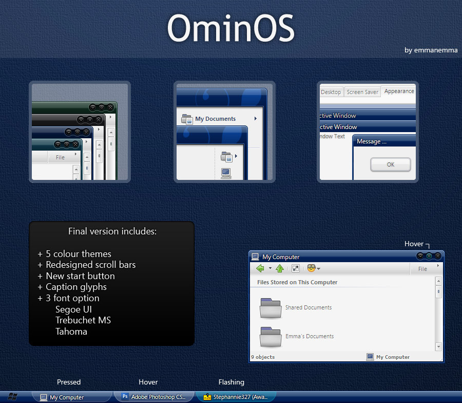
Lots of changes, download and use it to see!Thanks to all the deviants before with their critiques, all of you helped make this a better release. All infos in the preview.
p.s thanks ~teheimar and ~reactART
Related content



Comments: 128


I'm new with that ... Cam you help me ... i don't know how to install it
And it seem to be really nice ! Thanks for your answers
And sorry i'm a french guy ...soooo ... I'm just a poor writter in english ....


👍: 0 ⏩: 0


wow emma! this is really one of the best themes ever. this is so awesome really. you rock! i am expecting more great work from you soon soon soon!
👍: 0 ⏩: 0


Hi, thanks for this beautiful theme. 
I just wanted to let you know that like some of the other users, I'm having that "text getting cut off at the end" problem. I've tried to decrease the font size or change it entirely to a smaller-spaced font under the "Advanced" setting of "Appearances," but that doesn't look like it has an effect. This is still a very lovely theme and I enjoy using it, but I wasn't sure how to go about fixing the issue other than what I've tried.
Thanks again!
👍: 0 ⏩: 1

I think I found a solution to this:
Credit "gigapixels" at neowin.com
"ok i have great news! i was over at aquaxp and i found this fix to the font cut-off bug with themes like KoL's SmoothStripes and others... you have to edit the registry. in this example i'm going to be using the font Lucida Grande as an example. just replace that with whichever font you want as the main font of the GUI...
1. open regedit
2. navigate to HKEY_LOCAL_MACHINE\Software\Microsoft\Windows NT\CurrentVersion\FontSubstitutes
3. change the values in "MS Shell Dlg" and "MS Shell Dlg 2" to Lucida Grande
4. restart
you're finished! now everything will fit and will NOT be cut off! it's wonderful!!!"
I hope this helps in making this beautiful theme provide full appearance on text.
Link here: hxxp://xxx.neowin.net/forum/topic/81368-font-cut-off-fix/
👍: 0 ⏩: 1
Forgot to add; when changing the system fonts:
"Go to Start -> Run, then type regedit to open the registry editor. Now navigate to:
HKEY_LOCAL_MACHINE\Software\Microsoft\Windows NT\CurrentVersion\FontSubstitutes
Now double click on "MS Shell Dlg" and put in the font style you want as the value.
Then double click on "MS Shell Dlg 2" and again put in the font style you want as the value.
After you are finished, restart your pc. Just a note, make sure you enter a font that is installed on your computer, to see a list of available fonts, go to C:\WINDOWS\Fonts ." Credit icyj at neowin.net
Link: hxxp://xxx.neowin.net/forum/topic/318903-changing-windows-xp-system-font/
He also discusses font sizes in that thread.
Cheers.
👍: 0 ⏩: 0

Very nice but I noticed that it is cutting off the ends of some of the lines. This is even after installing the fonts included with the theme.
👍: 0 ⏩: 0

Ooh! very especial and delicious visual theme for XP SP3.
👍: 0 ⏩: 0

Can you PLEASE add some different font choices? IF you did then it would be perfect.
👍: 0 ⏩: 0

I haven't seen another nice theme for a long time.
Nice Work! Downloading it.
👍: 0 ⏩: 0

Any plans for some more colors?
Perhaps lighter ones or other shades say in red, orange or violet? (Not pink or magenta, btw)
This is a really good visual style and it is well thought out.
👍: 0 ⏩: 1

thanks! maybe soon, I'm working on another VS thats almost done.
👍: 0 ⏩: 1

I've discovered a little glitch! Some buttons and menu items have their final letter (or in some extreme cases, the entire last word) missing!
For instance, when i set it, and go to effects under appearance, the last letter of most of those descriptions are half gone. I checked that it wasn't my drivers or a problem with my pc by changing to another VS... It's not a humungous problem, but I think it is still something that needs addressing.
Thanks for the VS, your work is awesome. I will be keeping an eye out for anything more that you do!
👍: 0 ⏩: 1
depends on the font youre using I think. Windows by default uses tahoma, and sets the width of that particular part based on how much space tahoma font would need. Calibri shows fine for me, but a larger spaced font like trebuchet gets cut off. I'm not sure I wanna change it back to tahoma but I might not have a choice huh?
👍: 0 ⏩: 1
Oooh... On closer inspection, this might be because i'm using it on XP... and of course, Calibri is a Vista font...
I'm looking for an XP version atm, but i may have to stick with some missing letters!
👍: 0 ⏩: 2
*edit* found it. Office 2007 compatibility pack works a treat. I've not changed OminOSF to that font, and i'm working through the pages that had that little problem...
It's better, but still cutting off the very edge of the last letter... Could be a WinXP thing, so don't fret if you meant this to be for Vista. I would be happy to act as your XP Beta Tester though, if you want your VS's to work under both OS versions.
Thanks.
👍: 0 ⏩: 0

love the theme, thanks for your work on it.
I just started using themes, so don't know if this is an issue with how I'm going about it or with the theme itself, but it appears like the font size is too big for some text? it seems as if some text is getting cut off. e.g., when going to Display Properties --> Appearance --> Advanced, each of the Effect descriptions is cut off. some of them mid-character (I see half a letter)
Since there aren't any other comments about this in this theme/style, I assume it's not because of OminOS, but since I'm using it thought I'd post here.
And thanks again, emmanemma, it looks great!
👍: 0 ⏩: 1
I'll paste what I sent to the other person who mentioned this:
depends on the font youre using I think. Windows by default uses tahoma, and sets the width of that particular part based on how much space tahoma font would need. Calibri shows fine for me, but a larger spaced font like trebuchet gets cut off. I'm not sure I wanna change it back to tahoma but I might not have a choice huh?
dont worry, its not just you. let me know if its a big enough issue that it f*cks with your productivity, ill be happy to fix it. thanks for the input!
👍: 0 ⏩: 0


Check my page, i have this as part of this months theme.
👍: 0 ⏩: 0


very good work.... clean, efficient and creative...
👍: 0 ⏩: 0

I quite love the theme's overall idea, just the small function buttons are too dark, not convenience for use.
👍: 0 ⏩: 0

ey that was great! i downloaded the uxtheme patch and it worked! it was beautiful..thank you very much..you're a genius!
👍: 0 ⏩: 0

Another nice one! I'll look forward to more of your work.

👍: 0 ⏩: 0

This is really great!
and congrats on the DD!

👍: 0 ⏩: 0

Would be nice if the windows button is more recognizable
👍: 0 ⏩: 1
Personally, i like the darker start button..... It doesn't stand out much, which is nice.
👍: 0 ⏩: 0

Have you had time to check out the bug I reported? Changing font size from Trebuchet 8 to 11, few items like Windows Explorer, Start Menu still remain in Tahoma 8.
Since I use this VS during the past several days. I like very much this VS. May be it's my laptop, most of the color tone look pretty dark. Would you consider to create a lighter color variation? For example the green color you use for the flashing task in the "Green" color scheme looks very nice.
Thanks in advance.
👍: 0 ⏩: 0

I love this.
It's truly deserving of the DD it got; Great job!
But I have one question:
Whats the difference between the theme in the OminOS folder and the one in the OminOSF folder?
👍: 0 ⏩: 1
thank you! ominOSF is full start menu.
👍: 0 ⏩: 1
I love this theme, but can I request one thing?
It'd be nice to have it in red.. A sort of darker Maroon, like... *Pops open Photoshop*
#670707
or something deeper like #3b0505
That'd be awesome!
👍: 0 ⏩: 1
Awesome! Thank you!
I will look forward to it!
👍: 0 ⏩: 0

Very Impressive!
- Simple
- Elegant
- Tasteful
- Functional
Rare to find these qualities in a single package. My computer is my lively hood. Therefore I'm very picky about the styles that I use. Most of them have issues that prevent full functionality. Not so with this one.
👍: 0 ⏩: 0
it's not working on my windows xp..how do i make it work?
👍: 0 ⏩: 1
have you patched your uxtheme?
👍: 0 ⏩: 1
yes. i got a zipped file and i when i click the executable files there, the display properties of desktop appears but it did no changes at all. did i miss doing a step..? thanks. i apologize, i'm not that techy..i hope you could help me.
👍: 0 ⏩: 0

really easy on the eyes and smooth, good qualities to have.
👍: 0 ⏩: 0
| Next =>