HOME | DD
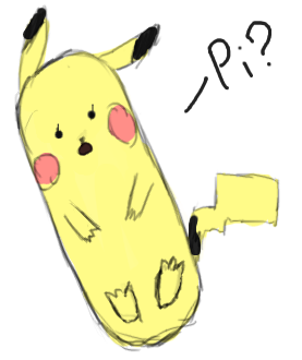
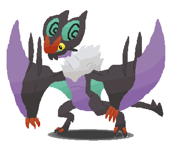
 FakingMe — Color Practice

Published: 2013-06-24 19:44:25 +0000 UTC; Views: 234; Favourites: 6; Downloads: 0
Redirect to original
Description
One of my good friends recommended I start working with contrast colors. Well, this was my first shot at it. Thoughts?Related content




Comments: 11

This is pretty good for a start. If you want more info about contrasting colors you could look up the color wheel and things like that to help you. There are even things about complementary, supplementary, primary, secondary, and tertiary colors on the web.
👍: 0 ⏩: 1


Nice work!
The colors really stand out.
But, I think the coloring style is not cohesive, for example, the minimalistic shading works better with cell shading, but yet, this one is painterly. And the painterly style work better with more volume.
👍: 0 ⏩: 1

To be honest I'm trying to balance the two, to make it something that doesn't look like either. Or maybe I've drawn the wrong conclusion? Experimenting with styles is really what I'm doing. Each "painting" I do is really a failure.
👍: 0 ⏩: 2
Don't think of them as failures. Instead, do more and more each day.
👍: 0 ⏩: 1
I think you misunderstood me. When I said failures, I mean that in a positive way, as in a way not to do something.
👍: 0 ⏩: 1
When I'm speaking of volume, I'm not referring to full rendered stuff. But something that shows the figure in a basic form.
There are various levels, of, rendering, or painting.
For example, 1. contemporary cell-shading:
[link]
The face is almost flat, and the volume is given by the shadows on the neck.
2. Soft shading:
[link]
3. Soft shading, with some hard areas:
[link]
4. Semi-painterly, but still maintaining simplicity:
[link]
Look at the face and skin, the shaded areas are almost the same on the ones in a simple cell-shading style image. The effort went to the hair and clothing, but still, you can discern a cell-shading geometric approach.
5. More painterly:
[link]
It has an approach that involves more rendering and volume, but still, some brush strokes are geometric, and not smooth.
[link]
This one is more smooth, but still shows a semir-realistic volume.
I guess you want something like 4.
👍: 0 ⏩: 1
I don't know. What style is this?
[link]
👍: 0 ⏩: 1
That is a form of semi-realism. The figures and faces show little stylization.
The color (except in the two first ones and similar) is not very detailed, since the line is giving texture and definition.
You can study this book:
[link]
👍: 0 ⏩: 0