HOME | DD
 getcarter — DECAY

Published: 2011-06-21 15:50:46 +0000 UTC; Views: 4550; Favourites: 257; Downloads: 4
Redirect to original
Description
An after-vernissage-shooting withZeche Zollverein, Essen, Germany, 2011
comments, favs and certainly critiques are more than just welcome!
How´that one?
by :
Related content


Comments: 37


The composition of this photo is amazing. Leading lines, diagnals, rule of thirds..all great.
The only thing that doesn't work for me is the colours seem a little flat and dark. I get that it's not exactly an area that gets much light, but I feel like it needs to be either higher contrast/darker and/or a colour adjustment would help.
Personally, I would slightly raise the contrast and brightness, as well as adjust the red, blue, and green levels. I've found that in photos where the subject has more muted tones, changing the hue or levels brings a little more "life" so to speak, into them. Other than that, it really is a lovely photo.
👍: 0 ⏩: 2

...simply consider the title. Would fat and rich colours together with a higher contrast fit here? I say no.
It´s most probably the DA´s mainstream with this rich and nonsensible setup, that lets you see it that way. I am about to leave this path. The colours and contrast are just the way I want them to be.
👍: 0 ⏩: 1
I'm not saying rich colours and high contrast. Not at all. I was merely suggesting a little more contrast and small amount more of colour. I get that the feeling is supposed to be one of decay, but that doesn't mean all muted tones. I get what you mean though. In fact, I detest over-saturated and extreme high contrast photos. It shows either a lack in skill or confidence in the individual's work.
👍: 0 ⏩: 0
Thank you for your words, the colours and contarst however are no accident.
👍: 0 ⏩: 0


This lovely work has been featured here: Architecture, Urban and Rural Spotlight Vol. 37
Looking forward to seeing more art from you at #devPREMIUM!
Einsilbig
👍: 0 ⏩: 0
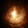
Looks like a video game or something. Kinda like Portal
👍: 0 ⏩: 0


Excellent use of perspective and the tone to this image carries a lot of weight. Very nice work.
👍: 0 ⏩: 0

du magst nicht zufällig mal 3D fotos versuchen? das müsste bei deinen szenerien die absolute wucht werden chris!
👍: 0 ⏩: 0


Gorgeous!! I love the hints of green throughout the shot.
👍: 0 ⏩: 0

This is a really photogenic 'set'; full of atmosphere.
👍: 0 ⏩: 0


This is a nice picture and a great angle. Good work
👍: 0 ⏩: 0


Ich hätte mir an den dunkelsten Stellen einen Übergang in "echtes" schwarz gewünscht (glaube ich - müsste ich natürlich erst mal sehen 
👍: 0 ⏩: 0

I agree, the contrast is the only thing not working here.. lol
👍: 0 ⏩: 0


I absolutely love this photograph, the atmosphere and prospective it was taken is spot on!
👍: 0 ⏩: 0

beautiful 
👍: 0 ⏩: 0


a) danke für die Erwähnung und
b) das sieht bei Dir ganz anders aus...
om.

👍: 0 ⏩: 1
a) schittebön!
b) was meinst Du? ein paar rohre und viel schwarz - bei meiner und bei Deiner Aufnahme
👍: 0 ⏩: 1
Ja, so halt... ganz andere Farben, Kontrast, Stimmung. Find' ich gut.
om.
👍: 0 ⏩: 0