HOME | DD
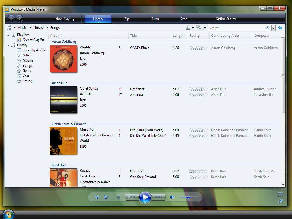
 gifteddeviant — A Modern Look for Windows 3.0

Published: 2013-01-05 01:17:06 +0000 UTC; Views: 3118; Favourites: 12; Downloads: 48
Redirect to original
Description
1-7-13 update: Changed the list in Program Manager to tiles and updated the background1-20-13 update: Changed background, made title bars darker, added a "x" button for close.
Related content












Comments: 18


Really nice , would be even nicer if it was colorful
👍: 0 ⏩: 1

Where could I add more color? The wallpaper or the interface? Or both?
👍: 0 ⏩: 1
Interface ((but enable switching to black mode))
👍: 0 ⏩: 0


Heck, I've never even used it, but I did the best I could.
👍: 0 ⏩: 1

you can try a simple online replica: michealv.org
looks fab btw! 3.0 has such a simple but effective ui and it looks amazing like this. see OSFirstTimer on youtube and click windows 3.0 and you'll see how easy she finds it (apart from when she opens qbasic)
👍: 0 ⏩: 2
I just tried it, and I found it EXTREMELY easy to use. Now I can make a few improvements. Thanks!
👍: 0 ⏩: 1
in the actual one there's lots more programs and settings but michaelv.org is basically like windows 3
👍: 0 ⏩: 0

Thanks! Do you feel that there's something I should add?
👍: 0 ⏩: 1

It feels too white, you should change the titlebar color.
👍: 0 ⏩: 1
It's been updated, but I'll probably make further changes later when I'm not feeling so tired...

👍: 0 ⏩: 0