HOME | DD
 guyintheredjacket — CherryRed Clouds

Published: 2006-02-02 03:02:15 +0000 UTC; Views: 715; Favourites: 13; Downloads: 73
Redirect to original
Description
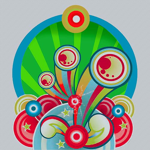
This is my secound deviation using my new style of vectorart... looks pretty good but i really wanna hear all you all's
feed back... kinda similar from my first vector deviation.
anyway hope yall enjoy!

Related content




Comments: 40

Nice, I love the mixture of colors, and the mixture of everything, its nice!
👍: 0 ⏩: 1

thank you kindly i thought the color scheme was spot on
👍: 0 ⏩: 1
your welcome, yah its nice!
👍: 0 ⏩: 0

this reminds me of a lot of oriental-styled art. i like it a lot! esp the clouds.

👍: 0 ⏩: 1
thankx i know i screwed up a bit but u can see it as
if it has some jappanese undertones i suppose
👍: 0 ⏩: 0

good compostion and colors

👍: 0 ⏩: 1
yea thanks maybe i stretched it out on accident or something maybe i'll re-do
it someday but i'll have to start from scratch
👍: 0 ⏩: 0


thankx glade u like
👍: 0 ⏩: 1

np you re welcome
👍: 0 ⏩: 0


Intriging design, looks very professional.

👍: 0 ⏩: 1
my thoughts exactalyy
👍: 0 ⏩: 0

I like it. The quality could be better, but I like it.
👍: 0 ⏩: 1
thank you for the fav
👍: 0 ⏩: 0

thankx just something a little i've been tinkering around with
👍: 0 ⏩: 0

Awsome art. The arts abit fuzzy... but that what happens when you save as a jpeg i mean my tinkerbell coloring look great tillit was a jpg. Anyway great job, Clouds look great, professional grade easy.
👍: 0 ⏩: 1
thankx yea i though maybe i'd make the quality better some how
👍: 0 ⏩: 1
if you find that out you will have to tell me cause i havent figured it out yet.
👍: 0 ⏩: 1

Nice man, love the clouds especially and the 'dirty' style of brush work. But yeah, my only critique is the quality in which you save the image. What program are you using? surely there is a little slider some where which controls how large the saved .jpg is.... i only say this because the image is only 82kb, and my latest deviation is similar dimensions but about 5 times the file size of this. nice works anyway, and good luck overcoming this problem.
fall.
👍: 0 ⏩: 1
yea that is a great idea i guess it is kinda small... that helps but i originally
had it saved in another format... the one for adobe illustrator then changed
it to jpeg
👍: 0 ⏩: 0

hmmm..quality not so good but the art is absolutely great!!
👍: 0 ⏩: 1
thankX and i do realize the quality issue...
👍: 0 ⏩: 0

cool, and I agree that you should re post this at a higher quality setting, Its a bit grainy
👍: 0 ⏩: 1
yea but what other format could i post it as?
👍: 0 ⏩: 1
what is it in? and couldent you render it or somthing of the sort at a higher setting
👍: 0 ⏩: 1
i did it in another pre rendered format but changed it to a JPEG
so i could post it
👍: 0 ⏩: 1
oh, What I was wondering is if you could raise the resolution a bit
👍: 0 ⏩: 1
i wanna but i really dunno how to

👍: 0 ⏩: 1
oh, the internet is a valuble source of information
👍: 0 ⏩: 1
thats a good idea! i'll cheak it out thankx
👍: 0 ⏩: 0

The red has a few sploches and I dunno if I like the shadow on the smear part but amazing choice of colors and I like the clouds a lot.
👍: 0 ⏩: 1
yea i never noticed but when i posted this file it got less sharp... that sucks
👍: 0 ⏩: 1
yea, that does suck, but beside that, you did an awesome job
👍: 0 ⏩: 1
thankx anyway lol
👍: 0 ⏩: 1
oh, i just realized that my comment sounded really rude... I didn't mean that your work sucked, I meant that it sucked that it didn't submit very well... I think you did a good job
👍: 0 ⏩: 1
no no it wasn't rude at all i'm kinda feeling the same way i'm just
a little puzzed how skecketchy it turned out
👍: 0 ⏩: 0