HOME | DD
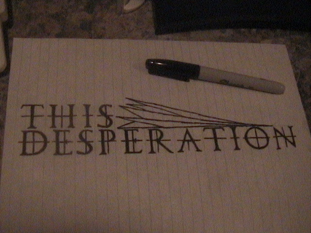
 GuyMonkey — This Desperation - Two

Published: 2006-07-31 07:23:52 +0000 UTC; Views: 495; Favourites: 5; Downloads: 15
Redirect to original
Description
This is the second logo idea I had for my band, This Desperation. Someone suggested the idea of "shattering glass" as a metaphor for desperation, and I just kind of went with it. I really like this, but I think it's a little empty.Edit: I am no longer with this band, so this is kind of irrelevant. Oh well.
Related content











Comments: 2

Oh my, I really like the idea though!
It seems, at least to me, that the plan worked out all too well. The way it looks seems fitting enough for the mood, and pleasant to the eye too.
As for the technical side, you could try getting the A closer to R, and the following TION, again, closer to the whole. You could also try sharpening the edges if you too would think it'd be better. Though it's just what I think anyway, and they're lighter than just optional. After all I'm no professional, nor a critic.
Keep up the good work, hehe.

👍: 0 ⏩: 0

maybe look at [link] for some more font ideas. you could add some variety in size and angle of the characters. also, connecting letters from the first first to letters of the second could be a nice effect for this.
👍: 0 ⏩: 0