HOME | DD
 H3LLB0uND — Hellbound_Designs

Published: 2006-08-26 20:27:28 +0000 UTC; Views: 716; Favourites: 0; Downloads: 12
Redirect to original
Description
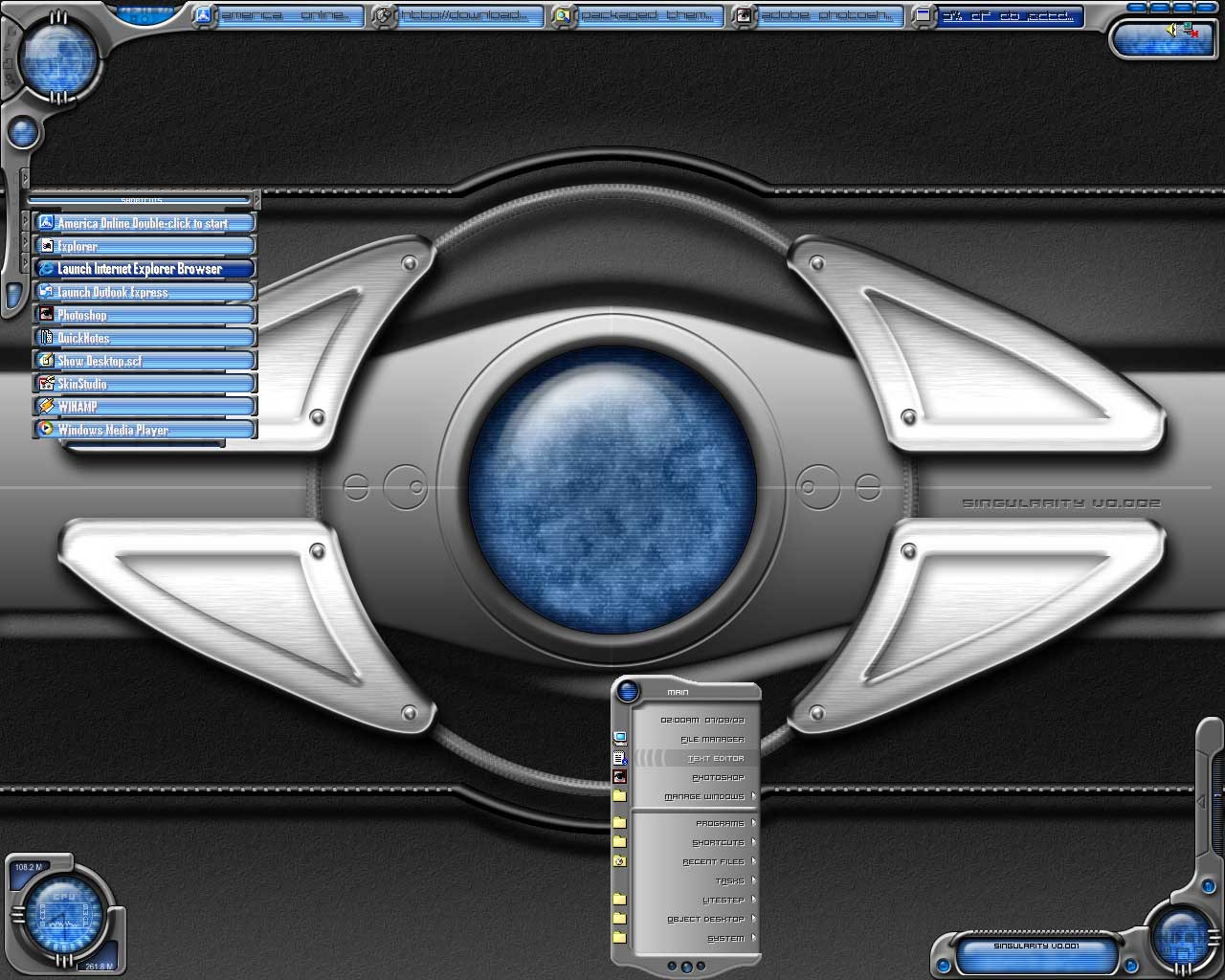
My new splash page logo for -> [link]Previous one sucked big time ..

Related content






Comments: 10

this is sweet i see you used the mirror effect looks stunning
👍: 0 ⏩: 0

Thanks 
👍: 0 ⏩: 1

yep and then you need to get some of the designs on it lol
👍: 0 ⏩: 1
haha dont remind me 
👍: 0 ⏩: 1
true but when its all up im sure it will be awesome
👍: 0 ⏩: 1
Thanks , I hope it will turn out good..
Check this little change I made today , what do you think - [link]
You like it better as red or in the green it is already ?
I'll probably just replace the whole design completely as soon as I have time though.
👍: 0 ⏩: 2
i like the red it goes with your name better than green would i think
👍: 0 ⏩: 0

👍: 0 ⏩: 1