HOME | DD
 ILoyal — #55

#blond #characterdesign #characters #daily #dailysketch #digital #face #from #girl #guy #imagination #ipad #kawaii #loyal #man #morning #person #portrait #studied #undefined #dailies #day55 #what #ipadpro #undefinedpracticing
Published: 2017-12-29 02:41:53 +0000 UTC; Views: 1528; Favourites: 72; Downloads: 0
Redirect to original
Description
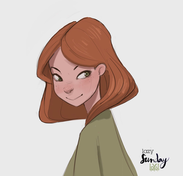
Practicing from imagination what I’ve studied this morning
www.artstation.com/loyal_art
www.facebook.com/LoyalAnm/?fre…
www.youtube.com/channel/UC3c3h…
loyalart.tumblr.com/
www.instagram.com/loyal.art/
twitter.com/Loyal_art
Related content






Comments: 4


First off, it's great to see expression sheets like this on Deviantart. It's such a refreshingly candid approach: no color, no composition, no narrative, it's just the drawings speaking for themselves. Since it's not a finished piece so much as practice and idea-building, so I'll try to critique it as such!
You draw very well- the line work is loose, intuitive and shows lots of energy. It's right in that grey area between sketchy and polished, and it's lovely to look at. For the most part, the form of each character is held together well. They all look very three dimensional and have distinct silhouettes, especially in the rounder forms. I'd say the more angular characters, like the two male faces on the bottom, feel a little less whole than the two above them. Both faces have less relative horizontal space to work within, and their geometry is more complicated from a 3/4 angle. It feels like you struggled a bit with them because of that.
All of these faces and expressions are lively, much because of how you've handled the drawings. I love the two center-top, I can tell exactly how they're supposed to be feeling with just a glance and I want to know more about them immediately. Again, the face on the bottom right loses me a little- it's not a bad expression, it's just not a very clear one compared to the others. My initial impression was hostility, my second was disgust. I think if a stronger pose was suggested, either recoiling or advancing, it would help.
There's a good deal of variety shown in the facial features and attitudes, while staying within your style. The look of these drawings isn't per say dramatic, but it is really entergetic and just pleasing to the eye.
It's a great sheet, both interesting and skillful. These feel like characters as opposed to just expressions, which isn't an easy thing to accomplish in a single sketch. You are a wonderful and talented digital artist, and I hope that I've said something in here that will be of some use to you! Cheers!
👍: 0 ⏩: 1

Wow, i agree we all you said specially about the male character on the right bottom, that guy was supposed to be clear that he was in disgust, didnt manage to do him rigth, i belive i was struggling with the porportions i wanted him to have, more then the expression, and for that he ended up stiff and unclear.
I should have made his chin touching his neck in a “repulsive fright” xD that would have helped
So thank you very much! That helped alot!
👍: 0 ⏩: 0

