HOME | DD
 interploy — darker than Heaven

Published: 2003-11-08 16:38:02 +0000 UTC; Views: 842; Favourites: 10; Downloads: 1127
Redirect to original
Description
It's been a while... this is the current working version of the layout for a new personal site of mine, darker than Heaven. The site has been in the making for a while, though this design is fairly recent. Anyway, let me know what you guys think of it.Related content








Comments: 16

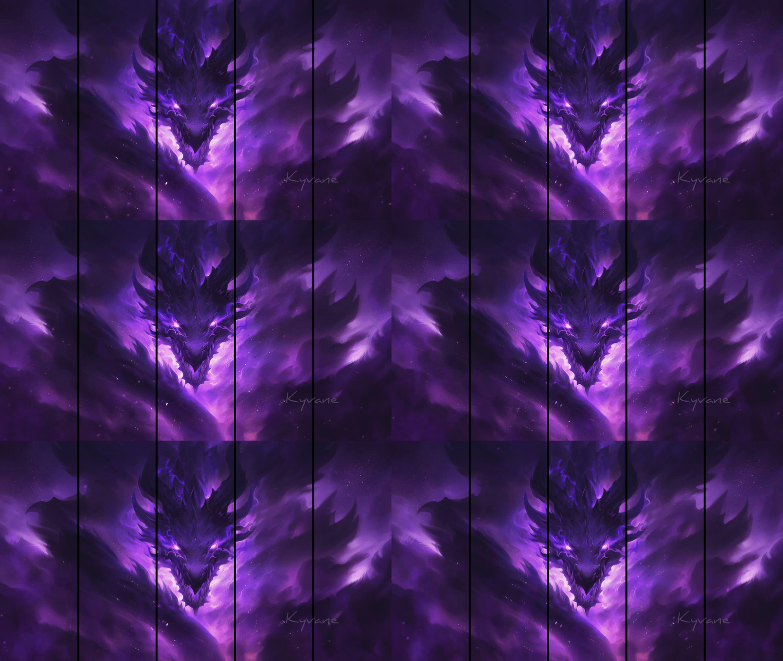
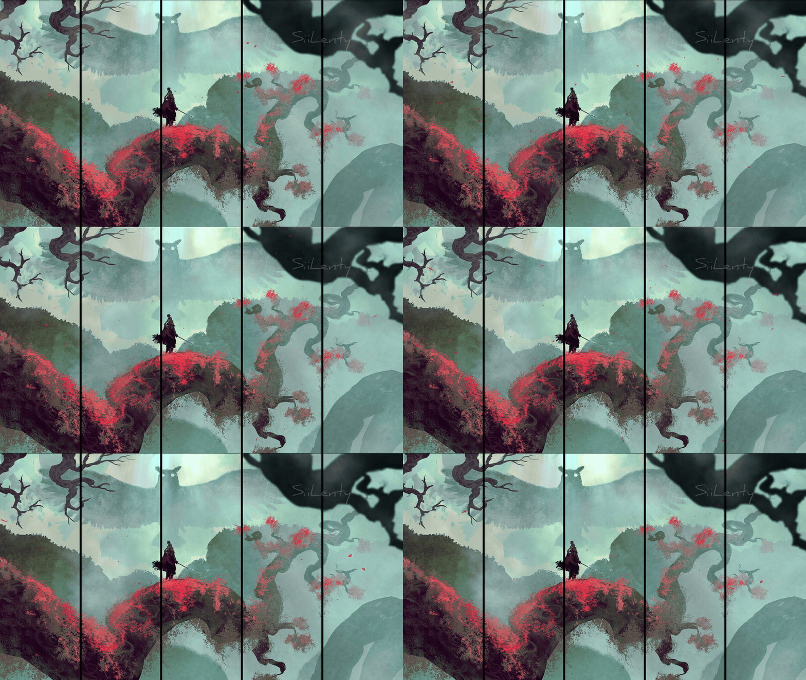
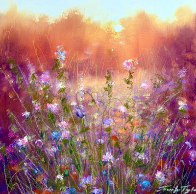
The yellow on the left is a bit strange (but it doesn't mess your design up or something). A really nice design, I like the way the 4 pics are shaped on the left with the images inside them!
I sometimes wish I could do such designs. *turns-red-in-the-face*
👍: 0 ⏩: 1

Hmm... Well, I've been trying the different colors that have been suggested... Although I can't really say the logo looks as good with gray or white... but then again the yellow does distract a bit... arg, I just don't know! Maybe a whole new log is needed or something...
As for being envious of my work, don't be. (thanks though, I've been envied before 
👍: 0 ⏩: 0

i'd probably use grey or able blue, to tie in wiht the rest of the design
👍: 0 ⏩: 1
Hmmm....might work at that. Heh, thanks remus! I'll give it a go!
👍: 0 ⏩: 0
the yellow in the logo on the left clashes with the rest of the theme
👍: 0 ⏩: 1
You think so? I've experimented with white and a few other colors, but yellow seemed to me the best compliment. What color would you suggest?
👍: 0 ⏩: 0

your layout is amazing. puts mine to shame, although your more than welcome to check it out and let me know what you think! 
👍: 0 ⏩: 1
Thanks so much for your kind words, I really appreciate it! 
As for your page I think the grunge style you have is great! It has a kind of ghost-type celetial fel to it. I really wish I knew how to do that, but every layout I've tried with it turned out horribly. My only thought is to get that tutorial page up and running!
👍: 0 ⏩: 0

That site design is absolutely gorgeous! I am so jealous of your talent. Well done and keep up the excellent work!
👍: 0 ⏩: 1
Thanks so much for your comments! It means a lot to know that all my efforts are starting to pay off.
👍: 0 ⏩: 0

Not bad.....although I don't like anime....it's definitely different....however, you have to make sure that the page is not too long....avoid scrolling whenver possible!
👍: 0 ⏩: 1
Thanks for your comments! I know what you mean with the scrolling. I don't plan on having the left side scroll with the rest of the page so I'm hoping that will help with the longer bits of text.
👍: 0 ⏩: 0

This looks really amazing. I like that the design is very smooth. And just, wow, I LOVE what you did with the images on this one. Really amazing work. I can't find even one little thing that I don't like in this one. This is definately a fav!
👍: 0 ⏩: 1
*blinks* *blinks twice* Why...thank you!! You really liked it that much? ...gee, this is the first fav I've ever gotten...kinda makes me all misty-eyed 
👍: 0 ⏩: 1
Awwness 
👍: 0 ⏩: 0
Oops, forgot to mention... the foxy lady on the left is Natalie from the game War of Genesis III by Softmax [link]
the lady with the moon is a piece called "Moonrise" by Stephanie Pui-Mun Law [link]
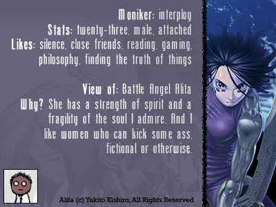
and the bottom girl kicking ass is Alita/Gally from Battle Angel Alita/Gunnm by Yukito Kishiro [link]
Also, sorry for the large image size, I didn't want to lose resolution...
👍: 0 ⏩: 0