HOME | DD
 karnf3st — Epic Logo II

Published: 2008-10-13 08:23:10 +0000 UTC; Views: 594; Favourites: 0; Downloads: 15
Redirect to original
Description
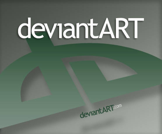
By keeping to the required specs I tried to improve on the logo itself by slimming down the 'd' to give it a more industrial feel. The logo is now more of a ombined concept where all the elements is part of one another in a continuous flow, like the Tao, which represents change and progression.The type has been changed to a more squared font to resonate with the appearance of the new logo. The art has been cropped to create a progressional feel as art is always in a state of change.