HOME | DD
 kramer989 — goodnight toad
Published: 2002-07-06 03:55:12 +0000 UTC; Views: 241; Favourites: 0; Downloads: 10
Redirect to original
Description
~Related content





Comments: 16


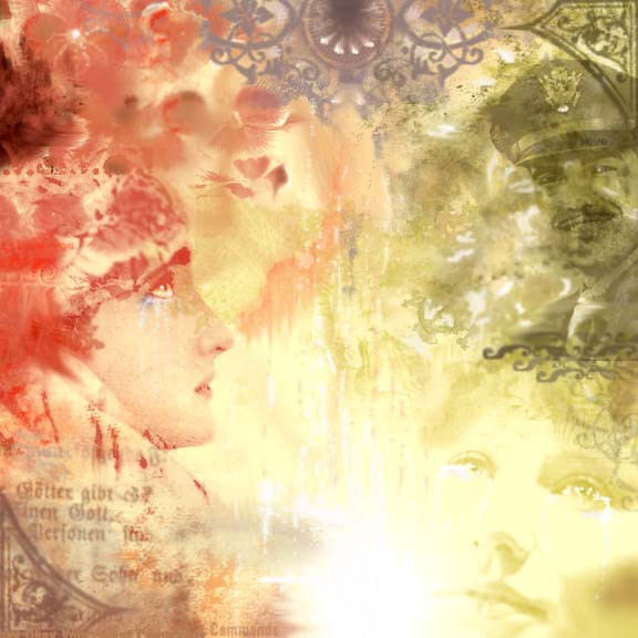
It's wonderful. The flow and motion of it is great. Nice and smooth. The expression of the faces add.. an unique feeling that I can't quite put my finger on. Very good work
👍: 0 ⏩: 0

Artistic...
And again that beautiful old german font.
I just love mysterious titles.
👍: 0 ⏩: 0

that is incredible
the way the colours flow and
fit together so perfectly
NICE JOB!
👍: 0 ⏩: 0


love the picture of the woman you used on the left, and the greyness seeping through at the top. Good to see some other artists on DA from this giant crap cornfield state of ours.
👍: 0 ⏩: 0

all i can say is that the colors are chosen nicely, the title rawks, composition is entertaining, and i mean that due to the fact there is so much motion going on which works (honestly, sometimes if there is too much it looks gross and cluttered) you did a really fabulous job with this. i also am digging the aged quality. i saw your icon. it said visit, and im glad i did !
👍: 0 ⏩: 0

Awesome! I like the use of color to divide the piece into two halves.
👍: 0 ⏩: 0


Wow...the colors are fantastic! And I love everything you put into it, but I think it needs a little text somwhere, and the top is sort of cluttered.
Great job, keep it up!
👍: 0 ⏩: 0

This piece reminds me of Art Deco/1920s style work, especially with the ornate elements and the woman on the left.. I like the colors, although the man in the top right looks like he could be selling a brand of tomato sauce or noodles or something.
That's Tori Amos on the bottom right, isn't it?
👍: 0 ⏩: 0


Pretty sweet composition color-wise. The scheme is great, has a nice glow to it. Composition as far as shapes go . . . I feel like something's missing. On one hand you didn't do the dull & boring placement of an object smack dab in the center of everything, however the center is empty. You have all that other stuffon the edges & nothing taking up space in the center. I think if you enlarged one of those faces & kinda placed it in a corner, but it still took up the center space it'd be rocking (I like the bottom right one for the job). But hey . . . that's just me.
👍: 0 ⏩: 0

i like this style, its grunge but not dark its sad but not happy. its good
👍: 0 ⏩: 0


I love this...though I'm not sure I get the title? colours are awesome...balance is great... sooo fluid.
👍: 0 ⏩: 0