HOME | DD
 LessOrdinary — LTEC_P

Published: 2004-11-03 08:26:46 +0000 UTC; Views: 1815; Favourites: 7; Downloads: 860
Redirect to original
Description
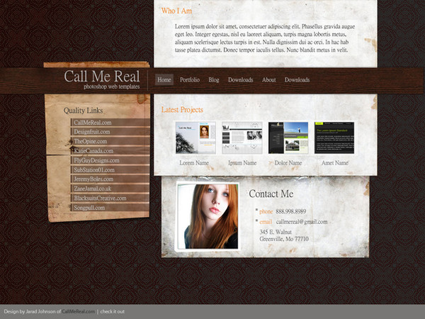
Can anyone suggest how to make it look better.. to me it seems a bit lackingRelated content







Comments: 33


awwww 

👍: 0 ⏩: 0


Only thing I think is lacking is the background hehe. But looks pretty good.
👍: 0 ⏩: 1


Hehe as usual great work. Simple an beauty at the same time
You can think about doing some with this logo (imo it's looking weird at this sky, maybe add some border or cut it off... i don't really know... )
👍: 0 ⏩: 0

to me it's nearly perfect. besides the empty space between the upper side and the its below.
👍: 0 ⏩: 0

me toooo! 

👍: 0 ⏩: 1


I love it when u say that! 
thanks pal!
👍: 0 ⏩: 0

lol, i had to bang my head into my monitor to figure out what it was with the background, but i found it
it seems you have a texture on your background, perhaps you can use a slightly brighter colour... overall very nice!
👍: 0 ⏩: 1
lol!
thanks for the comment
realy appreciate it!

👍: 0 ⏩: 0


why don't you add a grid background over the white color?
👍: 0 ⏩: 1
thanks for the suggestion
👍: 0 ⏩: 0

Maybe with those white boxes add a thing black border line around the edges, and where the text goes add horizontal pixel lines to give it a bit more depth.
👍: 0 ⏩: 1


Actualy... ide just leave it! .. looks very cool and professional as it is.
👍: 0 ⏩: 1
thanks a lot
i like the layout but i wish i cuold rearrange the content .. text/images in a better way
👍: 0 ⏩: 1
Nah.. I think its good to see a fresh way of doing things every now and then, But its up to you..
👍: 0 ⏩: 1
thanks for your comment
I'm not too happy with the current one.. i know it can look a lot better.. using some rearrangement.. maybe
👍: 0 ⏩: 0