HOME | DD

LessOrdinary — Models Agency 3

Published: 2005-03-16 14:09:25 +0000 UTC; Views: 1002; Favourites: 3; Downloads: 434
Redirect to original
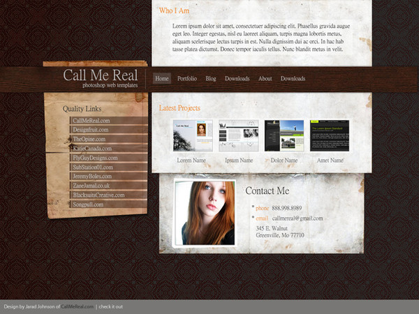
Description Greeeeeen!
Related content
Comments: 21

kopita [2005-06-04 22:55:44 +0000 UTC]

wows! its wonderful

👍: 0 ⏩: 1

LessOrdinary In reply to kopita [2005-06-05 19:50:41 +0000 UTC]

thanks

👍: 0 ⏩: 0

Agati0 [2005-04-19 07:11:32 +0000 UTC]

Very sexy, also well design, keep up the good work

👍: 0 ⏩: 1

LessOrdinary In reply to Agati0 [2005-04-19 08:35:23 +0000 UTC]

thanks a lot

👍: 0 ⏩: 1

Agati0 In reply to LessOrdinary [2005-04-19 08:55:45 +0000 UTC]

np

👍: 0 ⏩: 0

yadwigha [2005-03-19 18:26:35 +0000 UTC]

Layout's great, design and composition are just going with the flow. Now what is it that's bothering me? Yesss! It's the green... I love green but I don't know why it doesn't seem to be going with the theme. Could be just me.

👍: 0 ⏩: 2

yadwigha In reply to yadwigha [2005-03-25 19:31:35 +0000 UTC]

Did you see ogre or did you eat something bad? Just wondering... Kidding!

👍: 0 ⏩: 0

LessOrdinary In reply to yadwigha [2005-03-20 18:29:17 +0000 UTC]

hehehe I dont like green much.. not in layouts.. but i was feeling greeeeen so I had to!
(i wonder wat dat means)

👍: 0 ⏩: 0

zamir [2005-03-19 09:46:19 +0000 UTC]

Thats look very cool. Hey naveedha i am gona get the inspirations from your this layout. I wil show you as i upload this type of dzine i am gona upload on DA>

👍: 0 ⏩: 1

LessOrdinary In reply to zamir [2005-03-19 09:58:46 +0000 UTC]

sure

👍: 0 ⏩: 0

ned150 [2005-03-17 19:14:40 +0000 UTC]

text needs some more line spacing.

👍: 0 ⏩: 1

LessOrdinary In reply to ned150 [2005-03-17 19:17:28 +0000 UTC]

thanks

👍: 0 ⏩: 0

junaidplaner [2005-03-17 06:21:35 +0000 UTC]

well design & text placement! is very good!
i love this lay out!

👍: 0 ⏩: 1

LessOrdinary In reply to junaidplaner [2005-03-17 06:27:02 +0000 UTC]

u're so sweet thanks for commenting and liking it

👍: 0 ⏩: 1

junaidplaner In reply to LessOrdinary [2005-03-17 06:40:20 +0000 UTC]

oh! ehhumm ehhumm my plesure!

👍: 0 ⏩: 0

hsni [2005-03-17 03:49:36 +0000 UTC]

haan... i do think the same... pink will be better waisay aise bhi cool hai... aap ki marzi bhai... hum to abhi bachay hain aap k saamne

👍: 0 ⏩: 1

LessOrdinary In reply to hsni [2005-03-17 06:12:26 +0000 UTC]

pink is my fav too

👍: 0 ⏩: 0

eplebun [2005-03-17 00:36:18 +0000 UTC]

I'd go for the pink one Black - graytones - pink is always a nice scheme.

But i also think the menu should scream out "CLICK ME" a little more. But its up to you how you accomplish that

👍: 0 ⏩: 1

LessOrdinary In reply to eplebun [2005-03-17 19:49:11 +0000 UTC]

i like that one too thanks for commenting simon!

👍: 0 ⏩: 0

mole-incarnate [2005-03-16 14:11:18 +0000 UTC]

Very nice, nothing wrong EXCEPT (of course), the menu in the middle, its either not high enough, or theres too much space between it and the rest of the site. Other then that, thats one snazzy site.

👍: 0 ⏩: 1

LessOrdinary In reply to mole-incarnate [2005-03-16 18:37:25 +0000 UTC]

thanks a lot for the comment! I will upload another version of it tomorrow.. do check it out

👍: 0 ⏩: 0