HOME | DD
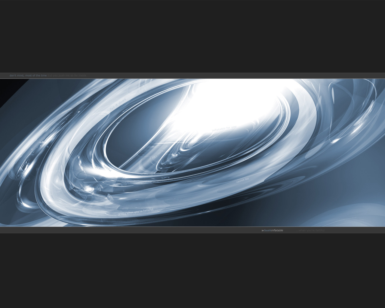
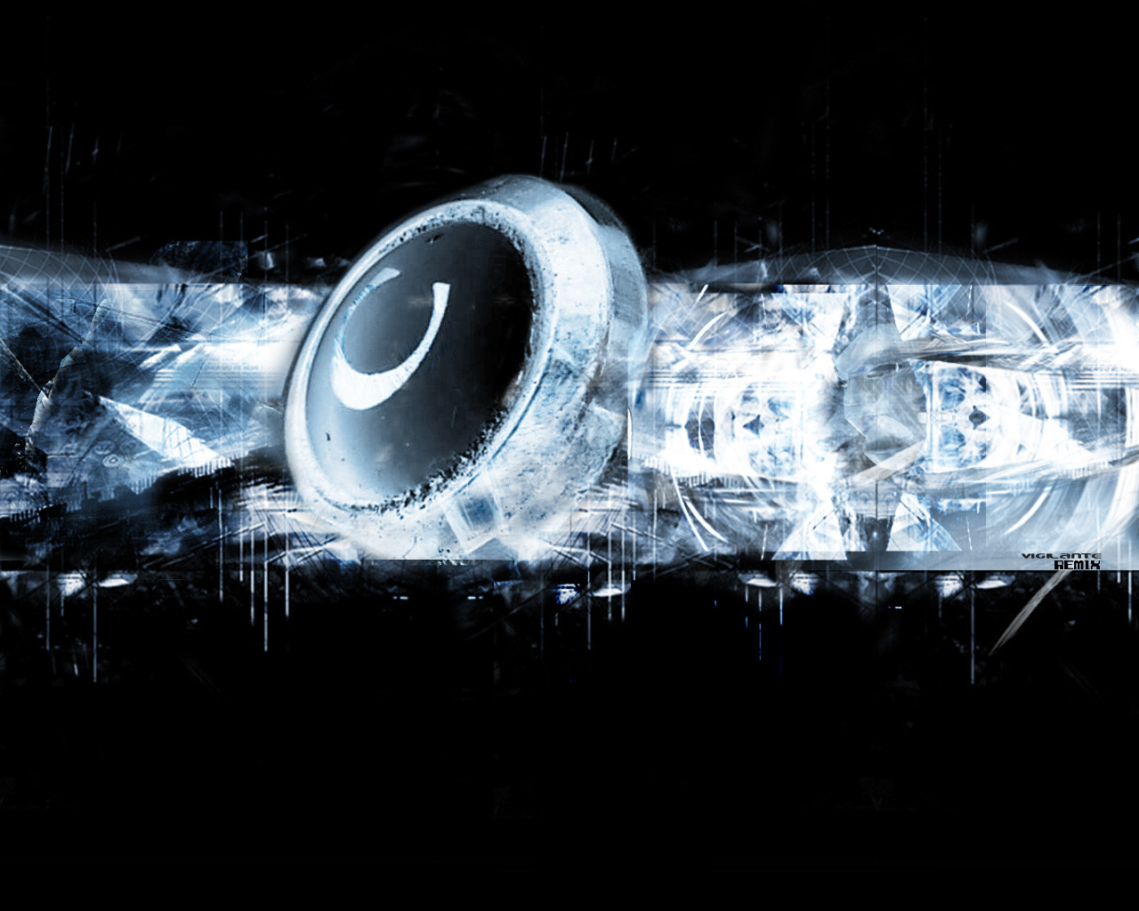
 mage — Solar Flare - Mage Style

Published: 2001-10-21 07:10:01 +0000 UTC; Views: 840; Favourites: 3; Downloads: 121
Redirect to original
Description
Hmm, I think I might be trying to become a trendwhoreRelated content











Comments: 13

yup, simplicity is what gets me straight away in this design 
Not much more to say really
Take care mate

👍: 0 ⏩: 0


it's very simple, but that's what i like about it
-TzeN https://tzen.deviantart.com/gallery
👍: 0 ⏩: 0

No, simplicity is bliss. Obviously, there's tons of room for all kinds of desktop fun, but that little thingie in the middle is my favorite part. It looks like a dove caught in mid-motion, and blurred like crazy. Nice work.
[-] Sal Loria
[-] icq: 134947546
[-] email: sasso@metadream.com
[-] website: www.metadream.com
👍: 0 ⏩: 0

The basic thing is here but something is missing, i don't know what, maybe it's the logo placement, i don't know.
Cool colors.
👍: 0 ⏩: 0

Also, not a 3d render, it's a mixture of different types of blurs which produces a neat effect.. I think there's a tutorial about it which uses a similiar method to mine on carbonfour.
| Mage is feeling devious |
👍: 0 ⏩: 0
lol, actually I got it from that image that says "Trendwhore".. it's on devart somewhere, don't remember who made it, just that I have it in my "ideas for graphics" folder Wait... well, unless that image is from wasted youth?
| Mage is feeling devious |
👍: 0 ⏩: 0

simple is awesome =] i can see u got the diagonal line idea off the wasted youth site but no harm done im not into the font though u used that goes into diagnoal thing..as far as the 3d render(i think) it looks cool..simple but cool..i like the colors of it..they like the ones on my latest wp which is at the bottom of this wonderful comment
pretty cool..but i think a lil more could be added
.·:·.shr00m.latest. https://www.deviantart.com/deviation.php? id=86404.·:·.
👍: 0 ⏩: 0

certainly is a bit trendy the flare looks really good though
[..louie..]
👍: 0 ⏩: 0

*Edit* Doh, I'm an idiot....
Wow, looks pretty sweet. The solar flare could be a great addition to a space wallpaper? Anywho, looks nice.
:: uknown 2 you ::
c:/bin/laden/ del *.*
::
::
:: have a nice day ::
👍: 0 ⏩: 0

its really cute, a bit empty
...
... ... ...
...
...
...
...
...
...
...
... ... ...
...
...
...
...
...
...
...
Head of OPTICO
From The Eye To The Brain
http://www.optico.f2s.com
👍: 0 ⏩: 0

lol. so little to judge. I think I'm able to handle it...
Well, hummm, I like the blue, and hummm the logo. And the font look good, also. Nice, Simple wall.
If see the Shadow in me, I will bring Light upon you. http://www.shadowness.com
👍: 0 ⏩: 0

like the look of the flare - and this is excellent for those of us who usually just have a black desktop.
: ::] regener8ed [:: :
if at first you dont succeed, skydiving may not be for you.
👍: 0 ⏩: 0