HOME | DD
 MarioWibisono — Matsu Rika

#bushi #bushido #japan #katana #l5r #legendofthefiverings #rokugan #samurai #zombie
Published: 2012-08-03 12:53:30 +0000 UTC; Views: 83990; Favourites: 3344; Downloads: 0
Redirect to original
Description
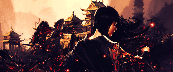
The horde of zombies had breached the wall with countless of undeads.It was an eerie sight but the noble samurai paragon stood firm.
Her blade slew all the incoming enemies while she calmly moved to find the source of the threat.
She was truly The Pride of the Lion Clan.
For Legend of the Five Rings.
Related content




Comments: 99


Amazing as always. The strange thing is that I was so focussed on the lady that I did not see at all that she was actually chopping of the head of that zombie.
so if anything can be better then 2 things. The zombie should have a bit more light on it so you can see it better also because it is a bit closer to the viewer.
The other little thing is that the blood should be more in form of drops, it is never that vage brush type of spill.
but again I wished i was half a good as you are
👍: 0 ⏩: 0


It looks very bright. The red stroke when the guy's head is cut off adds to the impact and vision. It's quite a good style but I've seen the blue and red put together too many times so it's a little cliche. It's a little hard to tell where the light source is for me though, which is a small problem. Her left arm being slightly blue looks beautiful and it looks like the light sort of reflected off the wall. The few scratches on her makes it look very realistic and they're very well detailed.
My criticism is that red and blue is a little cliche now. The light source is hard to find and the background doesn't stand out very well. I know it's not the main focus but maybe you could've made a bit more detail on it so it doesn't look as plain (or maybe that's just me).
👍: 0 ⏩: 0

The overall image is quite amazing, however I'd like to add some comments that you may find useful in the following drawings.
the hands position awkward, I find the position very much like the one used to voluntarly defeat you own sword in the katas.
The body looks off-balance, after striking a blow like that, the body must remain balanced and ready for the next.
Also the hakama has too many pleats (should be five) if you intended to be realistic about it.
Anyway great drawings and thank you for sharing them with us. Keep up with the great work.
👍: 0 ⏩: 1

I agree, the anatomy of her hand/arm is quite off and her hakama that is covering her legs make her seem off balance...
Overall it is still a stunning piece ^^
👍: 0 ⏩: 0

Well, just another beautiful piece of work, as expected.
I'm impressed about how full the artwork is. It has so much content, so many bigger and smaller details - if I can call them so - that can keep an eye busy for a long time. Each of them seems to tell us a story behind it and is used fair, giving us a bit of the atmosphere that I guess they are supposed to. Now that I'm at it, I'm also find it good, that those pieces are virtually separated; the helmet in front and a fresco (background, I mean) behind the character, cleverly indicated with the vertical lines.
The next thing I want to give a big thumb up is the use of colours. Virtual gradient of the blue (top right) to the red (bottom left) gives it the feel and it clearly points out where the action is. Big red splash of blood just adds it up, like a cherry on top.
Even though I mostly mentioned the bits of the piece before, may I comment on composition here as well how everything seems to be in place. The painting on the right is just enough detailed to give us enough realistic feel but is clearly not the main part, same goes for the rest of the background. That shine on the helmet is also just enough to let us know we need to concentrate on it, but not more than on the girl.
Now I just don't know what else to comment on. Clever arrangement of the details is what gives this painting that final touch. Skin feels silk-soft, so does the robe - with clear difference in material. The eyes are that perfect mixture of anger and ice-cold-blood of professional.
Is there anything I can complain about? Hardly, since I feel that any complaint would keep me in doubt whether I actually believe myself about that. If someone would ask me, what would give the 101st percent to the 100 percent good drawing, I might only say, that background might be a bit "too well drawn" and takes our concentration away from the main character. Of course, it's perfectly solved with the use of colors (the skin pops out), but in first couple of seconds when you take a look at it, and you ask yourself "now what a masterpiece I'm looking at?" you don't know if the first thing artist wants you to notice is a girl, or a helmet or the lion or the lady in the background. Keep in mind it's just nothing comparing to the overall beauty of the painting.
At the end, it really is a marvelous piece, displaying the overall combination of skill, great sense of aesthetics, knowledge of history and culture and whatnot an artist can and should have. I'm impressed as much as I can be. Now I just hope I didn't forget anything I really wanted to point out, but I guess 500 words is enough.
👍: 0 ⏩: 0

IT'S... JUST SO GORGEOUS... It looks so realistic, with all the cuts and scrapes and her amazing beautiful face! She just came out of a battle, it seems. Maybe you should add some bruises to make it seem even more fantastical and realistic, because it is improbable to come out of a battle/ war without bruises, correct? (My opinion of course. Do whatever you want to do. This is your drawing, after all. [If there ARE bruises on here and I cannot see them, I am very sorry! Haha e.deviantart.net/emoticons/s/s… " width="15" height="15" alt="

👍: 0 ⏩: 0



wonderful work... send you a request and invitation of my group
👍: 0 ⏩: 0


I feel I am not worthy of making a genuine critique, and ought to compliment your fantastic work.
However, something did catch my eye just now: it appears, from the shading of metals, her sword is being grasped upside down. The lighter, silver metal (usually representing the edge of the sword) is facing upward, and I can see a small line on the dark grey edge that might be the bo-hi...implying she reversed the sword in her hands after the cut?
This was the only thing that seemed out of place to me, and even so, the image was so beautiful, I thought it must have been deliberate.
👍: 0 ⏩: 0

The details are amazing but, at first I thank the zombie soldier was part of the wallpaper.I can stop myself wondering how do you do those hyper realistic pictures ?
👍: 0 ⏩: 0


This fine piece of art is featured at #AllWomen 's journal. [link]
👍: 0 ⏩: 0


It's very... Beautiful.
I love the picture.
And her face give a lot of feelings, we can guess what about she think, or almost.
I would like fight in her world, with her. =3
👍: 0 ⏩: 0

Wow this is one awesome pic, the whole thing is on a league of its own!
👍: 0 ⏩: 0


excellent stylistic use of the bg, hard to find a better samurai-ko vision art. one day the L5R movie should get such promo poster!
👍: 0 ⏩: 0

A very powerful work!
So full and so finished. It is vibrant with color and energy.
Bravo!!!!
👍: 0 ⏩: 0



Time for a critique!
Effective (objectively, since I never use my own opinion) art only has so many elements. It doesn't have to make sense, just has to look good through...
1. Moving Hair. It looks bland in the foreground, and good in the background.
2. Texture. Tons here.
3. Heavy light contrasts. It's good enough for me to tell the fore- and background apart. It's not dramatic, though.
4. Gradients. Clearly, we have a color gradient in the background.
5. Special Effects. In this case, the blood counts as special effects.
6. Matte painting/realism. Well, this is pretty straightforward, right?
Like I said, I don't use my opinion in critiques, so I'm not going to rate it.
👍: 0 ⏩: 0

I love the lighting and choice of background. Excellent work!
👍: 0 ⏩: 0

Sorry for a late comment.. But I just had to catch my breath!

👍: 0 ⏩: 0

Very beautiful samurai. I love the background and the intense look on her face. Very nicely done.
👍: 0 ⏩: 0


I always love how you make your art look realistic yet animated. I also love oriental themes you did.
👍: 0 ⏩: 0


I would prefer less flesh exposed, but the piece is beautifully done.
👍: 0 ⏩: 0

| Next =>