HOME | DD
 MichaelFaber — Reach Out

Published: 2008-03-02 06:08:57 +0000 UTC; Views: 13617; Favourites: 252; Downloads: 484
Redirect to original
Description
Hope you hate it!Related content




Comments: 90

Welcome to my TOP20 -your fractal has been featured in my journal >> [link]
👍: 0 ⏩: 0

I have featured this image in my Top 10 list for 2008 here:
[link]
thank you for sharing your artistic vision with us - and have a wonderful 2009!
Warm Regards.
Sandi
aka `oibyrd
PS - I apologize for the cut-and-paste - all a part of time management

👍: 0 ⏩: 0


dude...
I will help write, test, debut a tutorial...
Thanks for sharing

👍: 0 ⏩: 0

This one needs a DD so bad... 

👍: 0 ⏩: 1
Yes please! *Hands you a 
👍: 0 ⏩: 0

How the HELL do you do that?
I hate you for your brilliance.

👍: 0 ⏩: 0


Hi! Just wanted to tell you that your innovative fractal art has been featured in the news! [link]
👍: 0 ⏩: 0


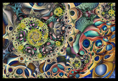
This piece is awestruckingly beautiful. The blurred areas are a piece of art themselves, and the gradient seems purposedly created for working on that fractal. 

👍: 0 ⏩: 0

Hello Michael, this is just stunning work! A big 

👍: 0 ⏩: 0

I really like the juxtaposition of blurred and sharp elements in this fractal. The shape is really cool, too.
👍: 0 ⏩: 0


Me again
I have featured this piece in the "Fractal Faves" section of my journal [link]
If you'd prefer not to be featured, please do let me know and I'll remove the image.
👍: 0 ⏩: 0

Another disgusting piece of cack from the Faber-stable 
👍: 0 ⏩: 0


Your technique and control of this program completely amazes me and depresses me all at the same time. It's great to see such an astounding image made in apo, but it so bewilders me that I have no clue how in the world you come up with such things. I've been using the program for a little over 3 years and have yet to come up with anything near as mindblowing as this. I gotta agree with `Platinus you truly should be sharing your wisdom with the rest of the fractal world
👍: 0 ⏩: 1

Thank you for the comment. Some day i will put the effort into a tutorial or three
👍: 0 ⏩: 0

I love the cellular effects here.
I also love how the blurring enhances the effect.
However, I hate how you can do this!! I have to know!!

👍: 0 ⏩: 0

I don't hate it, but I hate you for being able to do this...
👍: 0 ⏩: 0


My loathing of this is indescribable.
BTW, I don't know if you noticed, but I indulged in one of your calendars. It's horrid too... Really makes my wall look disgusting....
👍: 0 ⏩: 1
Thanks, Lindsey! dA doesn't say who buys my art. I appreciate it
👍: 0 ⏩: 1

Nice mixture of sharpness and blur... GREAT colours!
Amazing one!
Have a nice day..
C U 


👍: 0 ⏩: 1


I'm beyond words, this is sensational!
A perfectly balanced color palette, which shows details and shapes, but keeps a certain organic quality through the orange tones.
As for the slightly blurred portions: unbelieveable. Really great work there, it just adds such a huge realm of depth and diversity.
👍: 0 ⏩: 1
Thanks for the comment Matt!
👍: 0 ⏩: 0

For some reason, it reminds me of Ferrero Rocher chocolates, which are amazing as well.
👍: 0 ⏩: 1

Sucks..
I think this is soooooo bad that I must clean it and faved it into my trash-collection.
👍: 0 ⏩: 1

It depresses the entire club you horrid, horrid man.
👍: 0 ⏩: 1


if hate is meant is meant as love in this situation, then I absolutely hate it! xD
Anyway, nice job~
👍: 0 ⏩: 0

What fabulous work 
👍: 0 ⏩: 0

It's like a jewelry store(sp?). My friend has a necklace with a similar pattern

👍: 0 ⏩: 0

Another winner!
The textures are amazing as usual, but it's the larger-scale structure that makes it interesting to me, this is an image worth spending time "exploring" - I've just spent five minutes following all the curves and shapes round

👍: 0 ⏩: 1

I have featured this beautiful image in my journal this week. I hope you don't mind, but if you do please let me know and I will remove it. Thank you!
👍: 0 ⏩: 1
| Next =>