HOME | DD
 morphyne — Untitled-2

Published: 2004-09-13 22:37:24 +0000 UTC; Views: 569; Favourites: 4; Downloads: 106
Redirect to original
Description
I don't think there was a point behind this- I wanted to do it. Just for the sheer fun of it.Painter + Illustrator
Related content




Comments: 8


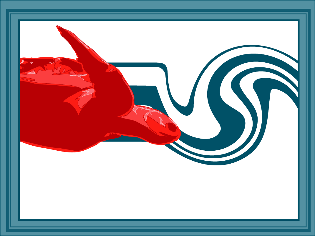
This is going to sound odd.. but the red combined with the lines.. it implies a motion. Such a motion that it reminds me of a heart beating. I see the "thump"... that's what really caught my eye...
👍: 0 ⏩: 0

I like it the stars are fun and there doesn't need to be a point in it if it makes you happy.
👍: 0 ⏩: 0

mmmm. dangly things on sweet pieces of work. i love that. . .
purty stars.

👍: 0 ⏩: 1

funny you should say that - cause it was inspired by one of your pieces

👍: 0 ⏩: 1
well shit! i feel all cool now!

👍: 0 ⏩: 0

Very cool random idea. The red contrasts nicely to the earth tone you used.
👍: 0 ⏩: 0

sometimes those are the best ones..
but this time that big star just irks me..
itd make a swank business car or an invite or something...maybe a valentines..
im jibberjabbering now dont mind me.

👍: 0 ⏩: 0