HOME | DD
 movezig — Such Great Heights

Published: 2004-04-27 04:21:12 +0000 UTC; Views: 800; Favourites: 16; Downloads: 312
Redirect to original
Description
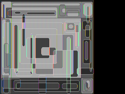
Still messin around with shapes and colors. I liked how this turned out so I thought I would upload. The title is a good song from, "The Postal Service."Related content


Comments: 19

such a great abstract design... very good work
It is a pleasure for anyones eyes
Best regards
👍: 0 ⏩: 0

first of all you made reference to "the postal service" so that alone kicks ass!!
plus this is pretty solid vector work.
excellent composition.
all round top notch work.
👍: 0 ⏩: 0

eye-candy
I love the clean colurs and the shapes.. nice work here

👍: 0 ⏩: 0


Im not sure of the colors but the shapes play well together

👍: 0 ⏩: 0

theres something to this, but the colors dont work for me..

👍: 0 ⏩: 0


I like the shapes and tiny line work as usual but that dull teal just urks me. I can't stand that teal on any composition. I also like the cut up photo (looks like a beach ?).
👍: 0 ⏩: 0


yeah this is beautiful! i really like the compostion of the image...
👍: 0 ⏩: 0

very nice stuff dude. I realy like the colors. it might be random or well planed.. it looks like you realy did some thinking before you placed out everything
👍: 0 ⏩: 0

i quite like the soft tones you mostly used. yet the composition is nice, i think there is something missing. not any great render or more 2d stuff, just some tiny contrasts around the center or some light shapes in the background to support the overall flow of the image. hope you know what i mean ..
anyways, your style is really unique, nice work
👍: 0 ⏩: 0

wow awsome work! I really love the color-use and composition. Great detail, magnificent!
👍: 0 ⏩: 0

maybe some typo in there would look cool, like 304mega or system304
👍: 0 ⏩: 0

typo yum yum
very clear and smooth. U got a very sharp eye when it comes to design my friend
👍: 0 ⏩: 0


loved it! it's pretty impressive how such a minimal work can be so attractive, by the colors and positioning used.
👍: 0 ⏩: 0


