HOME | DD
 napolean-hell — the solution
Published: 2007-10-13 16:21:20 +0000 UTC; Views: 292; Favourites: 0; Downloads: 2
Redirect to original
Description
the solutionText correction

thanks goes for
Related content








Comments: 7

Well, since the contest time is over, now waiting for the announcement, I'll give the crits for this one, maybe useful for future reference.
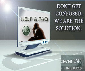
The Lens effects on the top left corner of the image doesn't have any function. It's best to remove unneccessary elements since they could disrupt the message.
You need to work more on the typography, try experimenting with upper/lower case, text layout, etc.
The deviantart logo is too repetitive, one is enough. Too many repetitive elements could make people lost focus on the main element.
If I'm not mistaken, the keyword is "solution", but an LCD monitor with a thinking man displayed on it doesn't feel for solution yet... I think you need to find more suitable image for this.
The "Help & FAQ" text displayed in the monitor is not distorted with perspective, but the monitor is distorted with perspective. Somehow I feel awkward seeing this. IMO though.
I think that's all.
👍: 0 ⏩: 1

wow 
wich you good luck dude !
👍: 0 ⏩: 1
eh... belay that competition has ended. I've just checked they extended the deadline to 6th November, which means you still have the chance to make something more better for this competition. Maybe I'll submit one more entry though.
👍: 0 ⏩: 1
eheh
may be in a month I'll came back with new works
I really hope you win. you deserve it dude 

👍: 0 ⏩: 1

So, in your very own opinion, which one is better, the previous one or this one?
👍: 0 ⏩: 1
I do prefer this words
👍: 0 ⏩: 0