HOME | DD

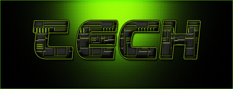
Nikeos — Ghosttech Logotype Finale by-nc-nd

Published: 2008-02-21 15:18:13 +0000 UTC; Views: 5333; Favourites: 39; Downloads: 173
Redirect to original
Description damn it, when will it end?!


Edit: Finally accepted by client.
Related content
Comments: 28

GraphicDesign00 [2015-12-18 00:26:06 +0000 UTC]

WOW, I LIKE IT...
-
also you can find free PSD Logo Templates at: FreeLogoPSD.blogspot.com

👍: 0 ⏩: 0

dhvanit101 [2014-10-25 04:49:53 +0000 UTC]

Which font you have used? thanks

👍: 0 ⏩: 0

Episoded [2008-02-22 21:00:26 +0000 UTC]

nice

👍: 0 ⏩: 0

Dyson247 [2008-02-22 16:46:09 +0000 UTC]

I like it, its realy better than the older versions

👍: 0 ⏩: 0

woweek [2008-02-22 06:16:04 +0000 UTC]

it looks much better that first 3 versions! ^______^

👍: 0 ⏩: 0

3R-BizZ [2008-02-21 21:34:15 +0000 UTC]

it will end untill you find the right one
but i think this one is a good work too

👍: 0 ⏩: 0

shftfrm [2008-02-21 20:48:09 +0000 UTC]

currently it's the best

👍: 0 ⏩: 0

osec [2008-02-21 16:50:48 +0000 UTC]

How much are they paying you?

I'd tell them to stuff their fucking logo.

👍: 0 ⏩: 1

Nikeos In reply to osec [2008-02-21 16:59:20 +0000 UTC]

dude if you read my journal input about me only starting to get into the business... you'd understand that since it's only the starting position for me, i have to make these first steps as hard as they are, and as cheap as they are... i will charge more soon..

meantime, how about 'apologize' for the piano?

👍: 0 ⏩: 1

osec In reply to Nikeos [2008-02-21 18:59:47 +0000 UTC]

so how much are you charging? just outa curiousity.

Yea do that piano.

👍: 0 ⏩: 0

meggert [2008-02-21 16:46:58 +0000 UTC]

ui, nice

👍: 0 ⏩: 0

pixel3 [2008-02-21 16:40:08 +0000 UTC]

i don't like the G so much. if it were me i would widen the whole G, and make the bottom half stretch closer to the H, so the straights are longer and it doesn't look so curvy.

other than that it's a sexy pink beast imo

👍: 0 ⏩: 0

traumaticc [2008-02-21 16:34:52 +0000 UTC]

best one so far

👍: 0 ⏩: 0

EnzuDes1gn [2008-02-21 16:27:46 +0000 UTC]

it ends now imo, best one yet

👍: 0 ⏩: 1

Nikeos In reply to EnzuDes1gn [2008-02-21 16:30:29 +0000 UTC]

That's what he said
it went further than a trilogy huh?

👍: 0 ⏩: 1

EnzuDes1gn In reply to Nikeos [2008-02-21 17:37:28 +0000 UTC]

yea lol, it was getting like rocky

👍: 0 ⏩: 0

arcticTransfuse [2008-02-21 16:20:58 +0000 UTC]

Yeh, the first one I actually like.

👍: 0 ⏩: 1

Nikeos In reply to arcticTransfuse [2008-02-21 16:26:23 +0000 UTC]

Thanks

👍: 0 ⏩: 0

Oosband [2008-02-21 16:07:56 +0000 UTC]

Yeah, I prefer this version too.
Great work.

👍: 0 ⏩: 1

Nikeos In reply to Oosband [2008-02-21 16:26:34 +0000 UTC]

thank you

👍: 0 ⏩: 0

amandhingra [2008-02-21 15:31:44 +0000 UTC]

nice

👍: 0 ⏩: 0

niponwar [2008-02-21 15:24:41 +0000 UTC]

i prefer this one more!

👍: 0 ⏩: 1

Nikeos In reply to niponwar [2008-02-21 15:25:19 +0000 UTC]

yeah!

👍: 0 ⏩: 1

Gabiton In reply to Nikeos [2008-02-21 16:07:10 +0000 UTC]

agree. Really niceeeeeee logo!

👍: 0 ⏩: 1

Nikeos In reply to Gabiton [2008-02-21 16:14:07 +0000 UTC]

soo... you have fav-ophobia or something?

👍: 0 ⏩: 1

Gabiton In reply to Nikeos [2008-02-21 17:34:52 +0000 UTC]

errrrrrrr yeah! im scared of favs...they are everwhere!!! whatch out!!!

👍: 0 ⏩: 0

moDesignz [2008-02-21 15:23:33 +0000 UTC]

very sexccciiiii logo

👍: 0 ⏩: 1

Nikeos In reply to moDesignz [2008-02-21 15:25:26 +0000 UTC]

thanks

👍: 0 ⏩: 0