HOME | DD
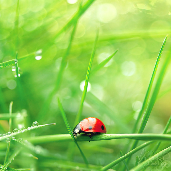
 NikolasBrummer — Ladybug's Adventure.

Published: 2010-09-15 18:33:10 +0000 UTC; Views: 2957; Favourites: 144; Downloads: 82
Redirect to original
Description
 Photography & Edit:
 By Me.
Editing Programs:Photoscape, Picasa & GIMP.
Devious Note:Lovely scene. He rather escaped from me than being my model ... Whatever. :'D Invertebrates hate me.
Related content





Comments: 73

Hello!
Your work was featured here: fatimazahraem.deviantart.com/j…
Have a good day

👍: 0 ⏩: 0


Your model is adorable. c: I love the shiny red against the green.
👍: 0 ⏩: 1


LOVELOVELOVE.
I just love this.
Ladybugs are so adorable<333
He may not have appreciated your lens all up in his grill, but I'm so glad you captured his cuteness. {:
👍: 0 ⏩: 1

thank you! (: I'm glad you like it.

👍: 0 ⏩: 0


👍: 0 ⏩: 1
to be honest, he flew away after I took this shot. so he was rather running for life.
Thank you!

👍: 0 ⏩: 1


👍: 0 ⏩: 1

Something about this is SO perfect it makes me want to cry.
This is literalty flawless.
Loveeee itttt x1000000000000000
👍: 0 ⏩: 1
Thank you very much!

👍: 0 ⏩: 0


I like the color and balanced image but the water seems to be the focus and not the ladybug ^_^
👍: 0 ⏩: 1
But actually the whole grass was focused, so I wonder why.
thanks anyways! (:

👍: 0 ⏩: 1

The part of the pic with the drops in the center is the brightest, so the eye goes there first - maybe that's what neokamatari meant. I like the composition.
Anwyay:
Sehr cooles Bild (:
Hast du das runterrechnen der Originalgröße dem deviantArt-Automatismus überlassen? Ist erstaunlich gut geworden

👍: 0 ⏩: 1
Yes, you're right! Now that you mention it.
Danke Danke! (:
Aber was meinst du mit 'runterrechnen der Orifiginalgröße'?
Meinst du, wenn ma das nicht in Fullview hat oder wie?
👍: 0 ⏩: 1
Nee, die Größe, die im Browser angezeigt wird, wenn man nicht die Originalgröße runterläd.
Das Original ist ja etwas pixelig/rauschig - und die im Browser angezeigte Größe überhaupt nicht. Das wurde ziemlich gut runtergerechnet, also scheint die dA-Routine was zu taugen.
Wenn du 'ne (z.B.) .PSD Datei hochlädst, musst du zusätzlich ein JPEG hochladen, damit hier in dA was angezeigt wird - ich dachte, sowas in der Richtung hättest du evtll auch gemacht, aber dann hab ich gesehen bzw realisiert, dass das Original ja auch in JPEG runterzuladen ist, also kannste die Frage vergessen (bzw wollte ich wissen, ob man quasi selber Original und Preview hochladen kann, wenn man nur JPEG hochlädt - hat sich erledigt 
👍: 0 ⏩: 1
Achso, jaja, ich verstehe, was du meinst. (also ehrlich jetzt
Mich regt es irgendwie auf, dass meine alten Bilder so rauschig sind. Viele von denen sind schön aber viele haben auch starkes rauschen. (und auch bei den neuen!)
Nur bei der Canon EOS 1000D Rauschen die Bilder schon relativ schnell und bei meiner Bearbeitung immer erst recht.
👍: 0 ⏩: 1
Scheizzz auf's Rauschen. Die alten Marilyn Monroe Portraits z. B. sehen aus wie mit Kohlestift gemalt (bestenfalls), und würden ohne Rauschen nicht besser aussehen. Beim Pixel-Beglotzen im Internet mach ich nicht mit. Und druck dein Bild mal aus, selbst auf 20cm-Papier wirste nichts störendes feststellen.
Es ist aber gut zu wissen, dass dA die Bilder relativ gut runterrechnet, da muss man nicht selber so sehr auf eine "internetfähige" Größe achten.
👍: 0 ⏩: 1
... Wo du recht hast, hast du recht.
Nur ich bin so an meinen Bildschirm gewöhnt und der ist dunkler als normal bzw. dunkler als der Pc von zB meinem großen Bruder und meiner Nachbarin.
Und auf den PC's sehen meine Bilder dann manchmal viiel zu hell aus und dann sieht man an den erhellten Stellen Punkte wegen dem Rauschen, wie zB auf [link] oben links in der Ecke.
Und da stört das Rauschen dann eindeutig, obwohl das für mich grad einfach dunkel ist.

👍: 0 ⏩: 0


Thank You ery much! <3
👍: 0 ⏩: 0

Nikkooo!
this is super
awesome colors.and sharpness.
and for a ladybug picture,the composition is quite original
most other pictures just focus on the bug and blur out everything else.
but your picture includes the awesome leaf with drops!
and i like hows there's three similar sized "dots" in the composition,
that is the bug,and the two big droplets.
awesome awesome!
haha.
oh and I've got a question,you wrote in the comments that you used photoscape,picasa,and gimp.
do you reaallly use ALL three programs to edit each photo?
what do you do in photoscape and picasa?
👍: 0 ⏩: 1
Thank You very very much!
Well, it's like this.
I usually upload my images to Picasa because its a pretty good program to have a view on the images. Unfrtounately it makes the images JPG automatically and so a lot of the sharpness gets lost, so I will maybe stop using Picasa.
but whatever, so I put them on Picasa and do little things on it like the first step with light and sharpness and add a B/W effect if it is useful.
Then I got to Photoscape and use the different tools of light and brightenss/darkness which seem pretty easy to handle with to me. Then, if it is useful, I use a Filter & Make the image a bit sharper. And then I add some color, but just a little bit , because I do the rest like colors, blurriness, curves and saturation mostly on GIMP.
And I add textures on GIMP.
Sounds like Hard Work, but I pretty got used to it, so I am pretty fast.
👍: 0 ⏩: 0

Amazing colours and sharpness... I LOVE it! <3
👍: 0 ⏩: 1
Thank You, Donna!
👍: 0 ⏩: 0


| Next =>