HOME | DD
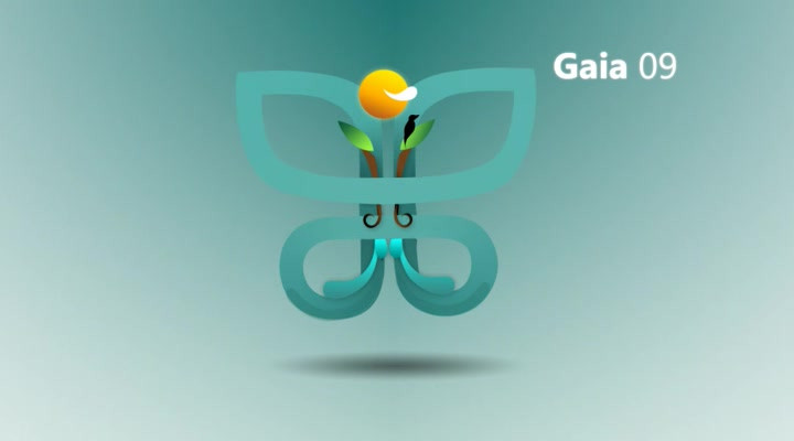
 PascalPixel — -video- GAIA09 intro
by-nc-nd
PascalPixel — -video- GAIA09 intro
by-nc-nd
Published: 2009-08-11 16:03:07 +0000 UTC; Views: 2271; Favourites: 14; Downloads: 85
Redirect to original
Description
Comments and faves very welcome!made on request by *imrik
so yeah i can animate,
it's not like i haven't learned anything the past year

enjoy!
[link]
[link]
[link]
[link]
Related content










Comments: 27

music is nice, but its too easy... you could something more with it I think...
👍: 0 ⏩: 1

Gaia is simplistic in itself
But making anything more elaborate would require huge amounts of time!
I'm actually going to do that though, so wait for the next version


👍: 0 ⏩: 0


Me too! I wish there was a possibility to get it on mac though.. patience is a virtue!
👍: 0 ⏩: 0
thanks you very much! i hope you enjoyed it, even if it is short xD
👍: 0 ⏩: 1

of course i enjoyed it
👍: 0 ⏩: 0

Two things:
1. I don't really like the gradient there; something more smooth could have been more desirable.
2. Instead of white flashes toward the beginning and when the words appear, it could be better if the whole thing simply fades in at the beginning from black, with the words fading in as the logo rotates into view.
Generally, I think you could cut it down a bit, but as for the animation of the logo itself, it's done quite perfectly and I have no complains about that.
👍: 0 ⏩: 1
1.
More smooth then a gradient?
2.
I thought the flashes add like a bridge with the music, in this longer version though (dA requires 10 sec minimal) they don't match up very well xD
I'll try your suggestions in the remake
Generally:
It's only 5 seconds really, streched it!
Thank you very much for the comment!


👍: 0 ⏩: 1
1. I think it's the kind of the gradient; I'm not sure exactly how to describe it, but allow me to try: I think you were trying to go for a circular gradient there, with the colour radiating into white from the top middle into the sides; what you did instead was like two straight diagonal gradients from the middle; you can see a "line" of colour down the middle, which is quite distracting.
2. If that was your intention, I could like to see a version where it is better synchronised with the music, if that is possible.
👍: 0 ⏩: 1
1.
it is a circular gradient, it actually grows during the vid,
it's the HORRIBLE, HORRIBLE codecs deviantART uses to screw up the uploaded videos
2.
[link] there you go
👍: 0 ⏩: 0


Looks good 
would be nice if it was a little longer and faster.
👍: 0 ⏩: 1

It'll be longer soon!
Thanks for the comment!
👍: 0 ⏩: 0

this looks cool .. make it longer 

👍: 0 ⏩: 1


