HOME | DD
 pernundle — Personal Card: Prototype
Published: 2006-08-06 06:03:11 +0000 UTC; Views: 426; Favourites: 1; Downloads: 27
Redirect to original
Description
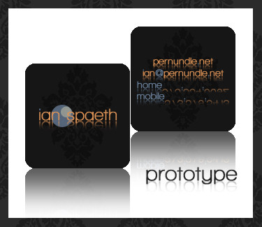
**Insight Please**So it's still very early, I really want peoples opinions on this. Its obviously going to change the more I go along. But I love it so far. This started out as a long slender white card. Then went to a square off-white card, then went black, then added the background image. I personaly love the background image, that's what got me to send it to dA. Please I really want insight, if anyone will give their opinions on how I can make this better, I will love you for ever!

***blurred out my number, forgot to, not safe, lol***
UPDATE
--I edited the orange text to make it brighter and stand out more. I also centered the background and redid the circular deisgn so its more clean and crisp. More updates to come!
UPDATE 2
--I made the background image just the singular fluer, so it looks more finished and draws your eyes to the center and not soo reptitive. More updates to come later!
 Ian
Ian
Related content











Comments: 9

I think it's great..but I think the reflection from the email, name, number etc takes away from the reflection in the logo. Whatever you do...don't lose those rounded corners..I'm a huge fan of rounded corners
👍: 0 ⏩: 1

I'll think about that. I never really thought about it taking away from the front side. Thanks for your input! I;m a fan of the rounded corners, too!

👍: 0 ⏩: 0


Thanks, yeah i like it, but i'm updating the orange text to be a bit brighter!
👍: 0 ⏩: 0

hello, only I would change the orange color into the stronger one ... I like the image of font and the source that you chose.
👍: 0 ⏩: 2
[link] There ya go, but you'll have to see what I said, I don't think a stronger ornage fit very well.
👍: 0 ⏩: 0
Let me see what i can come up with and then i'll upload it to my scraps and send you a note to the image, K? Thanks for the input hun! It really does mean a lot for an upcoming designer! I want to be the best i can be! The only way I can is through help and critiques, even if they are hurtfull(but your's wasn't).
👍: 0 ⏩: 1
I will wait for the note ... of insurance it will stay very well
👍: 0 ⏩: 1
So it wasn't in a note so other people could see it, lol! it's [link] there.
👍: 0 ⏩: 0