HOME | DD
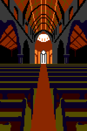
 Pix3M — Color study #2: Illiteracy
#church #pixelart #study #wat
Published: 2015-02-26 21:33:05 +0000 UTC; Views: 1915; Favourites: 36; Downloads: 9
Redirect to original
Description
I was trying to fumble the antonym of literal and I badly borked my EnglishThe challenge, in response to being critiqued of a bad habit of sticking with pastels, but I had other good examples in my gallery. The best shining example of 'good contrast' was another much earlier study but it was only possible because I was observing colors that were plainly there in the reference
So. No pastels this time. But, what can I do if every single reference photo I could freely used has 'bad lighting' and thus if I were to normally make a study of that, I would end up with the same habits that is apparently "bad". what if...
I was not allowed to use colors that I could plainly see because doing so gets bad results? I had to pick the stupidest of colors possible. Somehow, I got something nicely dark and nighmarish. I don't like it.
My inspiration for more "modern art":
Related content










Comments: 5

yeh, uhm... maybe try a higher resolution next time? I can see the pixels.
👍: 0 ⏩: 1

But I thought pixel art was about making art with giantic squares
👍: 0 ⏩: 1
don't worry... one day you'll get it right.
👍: 0 ⏩: 0

Wow, I really like this.
Very good use of a smaller pallet.
👍: 0 ⏩: 0

