HOME | DD
 rubywolf — We may not be the Hiltons...

Published: 2004-07-01 04:33:18 +0000 UTC; Views: 90; Favourites: 1; Downloads: 6
Redirect to original
Description
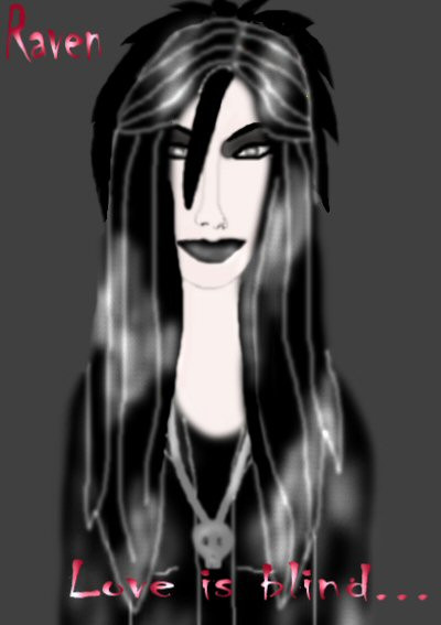
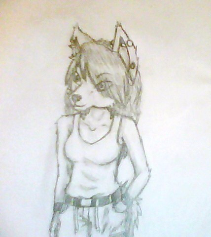
But we're SOOOOO much better...The goth sisters, Dilemma and Static. I tried using an outline to make it not look so blurry as much of my art, but I don't know if I like it that much. Please reply.
Related content






Comments: 9


LOL hell yeah they're better than the Hiltons! Dont get upset about it getting blury, it looks cool like that! :-p
👍: 0 ⏩: 1

Haha, thanks. The Hiltons really annoy me.
👍: 0 ⏩: 0

It's pretty, the outline makes it a lot clearer...blurring the lines a tiny bit would make them fit into the picture better....
👍: 0 ⏩: 1
Don't you see? The blurs are just coming back to haunt us!*squeals like a little girl*
👍: 0 ⏩: 1
lol. Now we jsut need to find a nice menian ::hauls out ehr junior detectives kit::
the problem is, that your coloring style is blurry in itself (not that it's a bad thing). Because your lines are so pixelated, they stand out alot and make your picture seem like it came from a coloring book. Giving your lines a softer look more transparent look would help incorporate them into the image.
👍: 0 ⏩: 1
They only became pixelated after I resized the damn thing.
👍: 0 ⏩: 1
yay, now they look like part of the image. I think they add real definition to your picture.
me likey
👍: 0 ⏩: 1
