HOME | DD
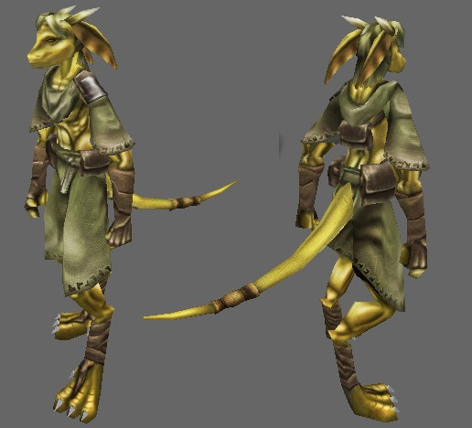
 Ryuujin-0 — In Dev: Gold Half Dragon Model
Published: 2005-09-16 17:13:11 +0000 UTC; Views: 5323; Favourites: 44; Downloads: 123
Redirect to original
Description
I'd decided to do a 3D model of my avatar character, or based thereof; Still in creation.Still feedback could be handy; like the colours feel washed out any bright ideas? (pun intended) Are the feet too big, toes too blocky, tail too thin; The hair I had some trouble with so I shaved that off for a moment, I'm thinking more of a mane-like style'd be appropriate...
That and a chance to pimp the model so far

Edit:
- Increased size of the hands, and muscle depth on the arms.
- Increased saturation on all skin areas
- Very slightly enlarged the head
- Added hair
Own thoughts:
- Could use a redder hue on the skin and leather areas, particulary in the shadows
- Could use stronger saturation on the cloth areas
- Wings havn't been added yet
(This screeny is from the game toolset with no lighting applied, the previous picture had manky lighting which didn't help)
Related content




Comments: 23

very awesome work! how would you like to join us here at MoyaGames to work with us on our MMO RPG called OmuniOnline! we need character modelers!
👍: 0 ⏩: 0


Very nice work ... what sort of tri and texture count are we looking at? It looks like a very effecient model.
👍: 0 ⏩: 1

Very low, I think wings inclusive it was under 1200 polygons, 512x512 + 256x256 textures... I think. It's been a while since I made it.
It was made for a last generation game, though I think that even with modern graphics it pays to keep polygon counts down, then you can afford to have armies of characters on screen without slowdowns

👍: 0 ⏩: 0

Bravo i really admire 3d moddellors but seariously this kinda takes the cake!
👍: 0 ⏩: 0

hey does this mean that you can do freelancer ship models? ^_^
👍: 0 ⏩: 1
Luckily not anymore 

👍: 0 ⏩: 1
Um, just < href="http://www.egosoft.com/">the best space sim ever, well soon to be phased out in favour of X3 which is in Beta testing now.
I'd dare claim (Heresy I know) that X is in fact *better* than Elite, which spawned the concept of sandbox space sims; Freelancer is little more than a cheap pretender to the title, having a rather heavy bent on shooting stuff, and less focus on economics and buisness.
[link]
👍: 0 ⏩: 1
yea.....what about eve online?
👍: 0 ⏩: 1
Never played it myself, one of my friends though plays it and he's taken prefence to X2 - apparently Eve is point and click interface :/ (X2 has more traditional flying controls, a joystick is highly recommended)
👍: 0 ⏩: 1
yea....well itd be cool if i could have a joystick for freelancer...and get the 3D goggle thing...then itd be trippin
👍: 0 ⏩: 0


Very nice, as always. The skin tone in your artwork seems much more dirty color than that of you avatar. Currently, the cloths he is wearing don't really compliment his skin tone well. It makes it look a bit too drab and uninteresting, even though the character is very original. I'd think changing the color of the cloths, or maybe making the skin the lighter yellow might make it stand out more. Also your avatar seems to have hair, which isn't on the model (though I don't know how that'd really look). Anyway, I really like what you've done, great work bud ^_^.
👍: 0 ⏩: 1
*nods* - I have a tendency to overwork the greyscale shadows too much and it muddies the overlay colours, especially on faces, I suck at faces. I've also been thinking of switching the hue of the clothing entirely, maybe blue?. I could do a full reskin of plain white robes instead though.
The hair has since gone on now - I'd taken it off there because it was really messy screwed up development phase, redone it now. (I'm using alpha maps for the hair, so think Unreal tournement or Final Fantasy X) - *goes mess about some more*
👍: 0 ⏩: 0

Sweeeet, the face seems a lil wonky though but that could just be my tired eyes.
👍: 0 ⏩: 1
I dunno, it does look a bit manky. It's kind of a fine line, too many lines and stuff and it looks manky, too few lines/too soft and it looks feminine. Although given the hair it could be the Bishounen of the Draconic world
👍: 0 ⏩: 1
Your avvie looks a bit bishie so I spose you could try that
👍: 0 ⏩: 0

Hmm... Well, I don't really know enough about 3D modeling to give any critique on that... But stylistically it seems kind of unbalanced, the hands don't look like they fit really. It's probably just me, but I'd say thicken the forearms and wrists. Make the hands fit better in proportion with the feet. Beyond that... I would think making the skin a little brighter and the clothes a little darker would help make them not blend together so much, right how especially on the upper torso it does that. Might help to tone down how dark the shading on the musckes and such is too.
👍: 0 ⏩: 1
*scales up the hands* - I also found the horizontal scale of the arms was much wider than the depth, which made them look odd since from the side they looked quite lightweight, while front on they looked muscular. But yeah, you're right hands and feet scaling should be the same *fixed*.
There's actually some delibracy in scaling between leg and body proportion (Make it less human), but it seems to have gone a bit extreme so *tweaks* - any more bright ideas let me know
👍: 0 ⏩: 0
Oh forgot to mention, this is a lo-count model (ie. for use in games), rather than a high count for high quality renders and artwork.; poly count is on a scale comparable to Half-life 2, no normal maps.
👍: 0 ⏩: 0

I liked the hair so far, it was pretty decent. I also don't think much of the head/body proportion, he seems a bit narrow at the top. Apart from that, excellent! The colours are fine- but maybe use a bit brighter colour for his skin/scales/whatever, hmm?
Apart from that, commendable! 


👍: 0 ⏩: 0