HOME | DD
 shadowdee985 — Mario Face In The KC 1998 Logo

Published: 2011-08-13 14:04:25 +0000 UTC; Views: 2807; Favourites: 4; Downloads: 318
Redirect to original
Description
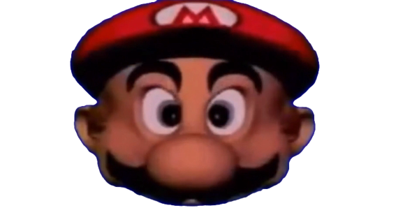
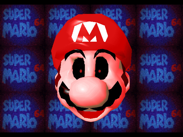
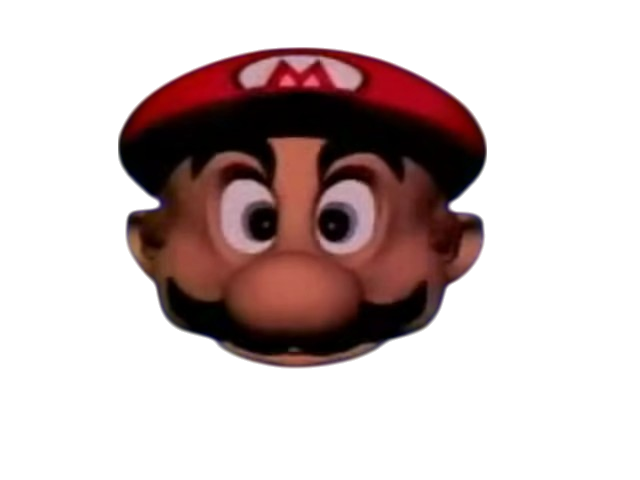
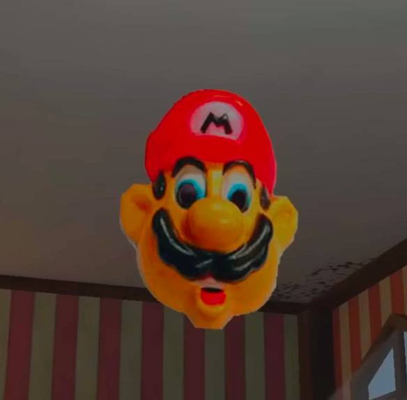
Shadow Dee Productions - The Company Of 985's 2nd Logo(2011-)The Nicknames Called "Super Scary Mario's Face" Or "SSMF"
Logo
 ver a static purple background, a blob of black ink emerges from the center, soon followed by blue ink. A hand passes by and The Head Of Mario,The mouth says the company name as white Letters,after that, two black Letters quickly slide from the top and bottom of the screen (covering up both the background and the Mario's face, but not the SDP - TCO 985 Letters) fly out from the mouth. This logo comes in two versions: a widescreen 16:9 version (for movies) and a fullscreen 4:3 version.
Variant:There was a different variant where the animation was somewhat worse (EX: the ink is still once it has splattered onto the screen, instead having a poorly done ripple effect), there is a black background instead of a purple (and there is no static)
the logo blurs and cuts to the SDP - TCO 985 logo rather than having black boxes cover it up, the music is in warp speed, and to top it all off, the mario's face constantly looks at us throughout it's screen time, and smiles as if it accomplished something before fading to black.
On Super Awkward Bros:The Machinima Series, The Logo Is Still, which completely skips the Mario's face
FX/SFX/Cheesy Factor: The Mario's face looks creepy, the CGI is cheap, and we hear random sound effects again. For the alternate variant, why were the ink and the Mario's face even more cheaply animated, and why exactly does the mario's face smile like it accomplished something? It's just disturbing. None for the Still variant.
Music/Sounds:A "splattering" sound when the ink appears, and a bouncy "beeping" version of the 15-note bass jingle from the Super Mario Song plays during the Mario's face's screen time. The company name is stated in a Mario voice (Voiced By Charles Martinet,hence the "Mario" nickname, the voice was supplied by the "Boing" novelty voice in the the text-to-speech program on Mac OS 9 and Mac OS X). After the company logo appears, we hear a couple of cartoon sound effects: a lip-flapping sound, a goose honking, and a boing sound. On Donkey Kong Country:The Movie and the alternate variant, the music is in warp-speed as the logo fades to black
For The Newer Variant, The Company Name Is Replaced By The "Its A Me,Mario!" Line
Availability:Seen On SM64 Bloopers,Icon Prime
 ino-Predators,Super Awkward Bros,Dark Chief,Grenades For Justices,And More
Scare Factor:NIGHTMARE! to WTH!,The mario's face looks like something right out of a nightmare, This logo is is random and disjointed. Children will probably find the logo nightmare-inducing (though some can find it funny), though adults might find it merely annoying.
For the alternate variant,NIGHTMARE! to WTH!
The bad animation and the mario's face looking at us and smiling as if it accomplished something is an even more unsettling sight. The black background also adds the reason why this variant is scary. Though it can be decreased to medium for those who expected this.
None For The Still Variant, as it completely skips the mario's face altogether, which makes it a LOT less scary.