HOME | DD
 silvermind — becoming

Published: 2001-07-02 02:41:03 +0000 UTC; Views: 441; Favourites: 1; Downloads: 146
Redirect to original
Description
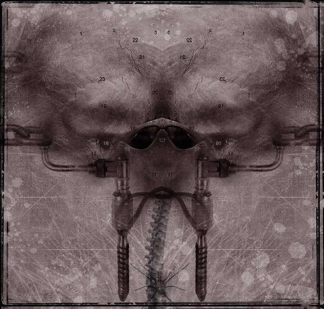
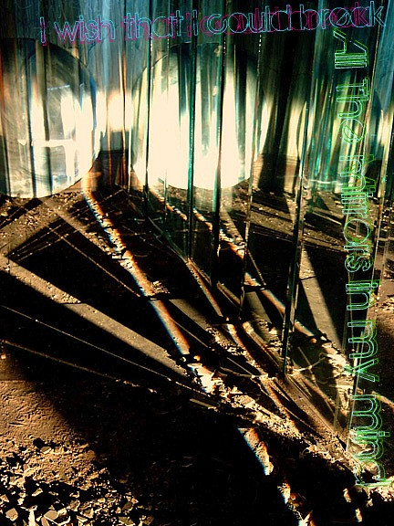
this is my first wallpaper with a white background.what I first wanted it to look like, is nothing how it turned out.
Related content







Comments: 6

i like the image. and i like the font.. it breaks the harmony of the whole, and thus it gives me a feeling of alienation and estrangement. they're disturbing, yes, graphically, but doesn't that suit the song that inspired it? (i've done a few nin visualizations myself, and i've been considering doing one of "becoming" too - but i've been considering a different approach... still, i like this one, anyhow.)
👍: 0 ⏩: 0

Very nice, not exacltly my type but I think its pretty good.
::Signatures Suck::
👍: 0 ⏩: 0

The font I used on this is called "Magna Veritas"
[ - sarah
http://www.violet-ray.net
👍: 0 ⏩: 0

having tried to make white walls and failed i have much respect for the person who can make one and make it look this good. great job...nice manipulation. (and what is that font?)
.:spunj13:.
.:happiness is a mask we wear to hide our fear:.
👍: 0 ⏩: 0

white walls are more difficult than people think. while the manip across the middle is great i'm not sure if i like the text that much, it does seem out of place. but in a way, it does'nt. it does have some grungy overtones and kinda fits in.
nice work
//
👍: 0 ⏩: 0

Nice orange tint and photomanip across the middle, even though the font that the text is written in looks somewhat out of place.
Well done.
👍: 0 ⏩: 0