HOME | DD
 Slainmonkey — Character Development Meme

Published: 2010-12-30 15:36:22 +0000 UTC; Views: 2854; Favourites: 21; Downloads: 13
Redirect to original
Description
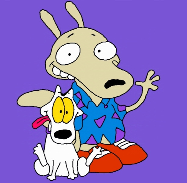
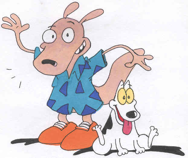
Of all my characters Warreck has undergone the most changes, so I really wanted to do this before the year ended.Here a blank copy: [link]
Related content


Comments: 100

Well if you've seen seen the old silent Pat Sullivan or to a lesser extent Twisted Tales of Felix the character wasn't always so innocent
👍: 0 ⏩: 1

I havent seen all of them, I saw the old mickaey cartoons and I was shocked to see how much he changed
👍: 0 ⏩: 1

I can't help it, he's fucking sexy.
👍: 0 ⏩: 1

Well Looks like he has undergone some attitude changes too. XD He looks so amazing on the Right.

👍: 0 ⏩: 1

This is the first time i've ever seen your character.
I'm just giving a little critique 
I like your character. He's got the charm of the old classic cartoons. Reminds me of Looney tunes or Old Disney style.
However, how he's developed, he's got so much detail put into him, he's lost his old-timey charm.
Maybe a combination of the two, together would give him the class of the olden-days plus a new twist?
👍: 0 ⏩: 1
I suppose so, but at the same time the original it bared too much resemblance to actual existing cartoon character from those days, so much so that he barely distinguished himself.....or at least that's how I see it.
👍: 0 ⏩: 0

this is really nice....its actually very astonishing too see how peoples characters change...almost makes me wanna post one of my oldest pics.
👍: 0 ⏩: 1
Older work is always cool because it show how an artist progresses
👍: 0 ⏩: 1
yes it is,its amazeing too see where they come from and why,believe it or not foxfire was my first created character,ill let you know when i get too posting it. question is it okay with you if i print a pic of warren? ill be more then shure if anyone asks that hes from you. i showed another aspireing artist your character and she seemed pleased. i was showing her my orieo prop,she said oh god at his expression rofl,reason for wanting too print is too draw his reacton too orieos crazyness so i can have a refrence,and i usually draw at work and my cellphone really dosent do the justice.i AWAYS ask before i do something with a pic.
👍: 0 ⏩: 1
Warreck you mean, and yeah you can print the character up
👍: 0 ⏩: 1
yes sorry....for some werid reason warren keeps comeing up in my head...maybe i have a nickname for him and thanks.
👍: 0 ⏩: 1
mkays that will be my/foxfire's nickname for him. ill have too warn people ahead of time XD. im going too start drawing like crazy. im back in action its great too be back. everything got overwhelming for a while.
👍: 0 ⏩: 1

When I look at this, I swear, I hear the rant of Sonic Fanboys in my mind XD If you asking me, you are on a good way to improve yourself. Maybe one thing... the linework of the earlier drawing is a bit cleaner than on the new one, but this is only a minor point.
👍: 0 ⏩: 1
There's a reason for that, back when I was doing the original I used to go over like linework in Illustrator. I personally find that it kinda looks too clean and elements I liked about the original drawing would there fore be lost in translation and ultimately just look too sterile.
👍: 0 ⏩: 1
Ah... I see. You wanted, that people see that you made the drawing and not a program. That's okay. In modern days, there are less artists, which are not using oldschool ways of coloring and linework, because is looks more clean when you make this via Photoshop or Illustator. But it has, in my opinoin at least, a bit more charm when the linework is drawn by hand and not by PS. Sure, modern comic artist has to use this way, because they introduced it as a standard nowadays and can't go back to the traditional way, but pure artists like you and me should stay this way. It shows what they did and how they did... I mean, everyone can use linework in PS or Illustrator, but to draw a clean linework by hand... that is a different task and not everyone is good into it.
👍: 0 ⏩: 1
I think also there kinda and oldness to that which kinda works with my style, well at least more then Illustrator does. I mean I do think it works for some artists but I never felt like it gelled fully with my work. I still colour in photoshop
👍: 0 ⏩: 0

I like the color scheme of the original more, haha but then again I'm bias for color-grays and muted values :b Also maybe because he’s more old-style cartoon with rubber-hose limbs and balloon gloves 
👍: 0 ⏩: 1
I did colour him a tad brightly I'll correct that
👍: 0 ⏩: 0

your style has alot more texture now. o.o
👍: 0 ⏩: 1

He has had signifigant changes and Im sure quite a few can see that. I really noticed for one tha he has gotten taller. Another thing like some other sad is the amount of noticible detail. All in all this sums up a year o change very nicely.
👍: 0 ⏩: 1
over 3 and half years really
👍: 0 ⏩: 1
I was actually working on a similer picture like this, I like the changes done here you did. The left one looks more like Ren and stimpy-like drawing style, but I like how you modified the tail to look more like a weasel instead of rounding the tip of it like in the left picture.
👍: 0 ⏩: 1
Thanks, the original design was too simplefied
👍: 0 ⏩: 1
Yeah I can see where it took a big leap in detail, you gave him more on his personality by making him look more rugged, the left one is nice too, but looks more, "cute" I guess you could say
👍: 0 ⏩: 1
Indeed, I think my style is substantially less cute then it was back in 2007
👍: 0 ⏩: 0

Ah I see. The past one give me an old toony feel, while this one is more realsitic. Least that is the way I have seen it.
👍: 0 ⏩: 1
You mean the old one was less my style I think?
👍: 0 ⏩: 1
Oh know, I was just saying it has changed, I was simply comapring it with something else.
👍: 0 ⏩: 1
I hope I didn't sound offensive.
👍: 0 ⏩: 1
good. I am relieved. Last thing I want to do is upset you.
👍: 0 ⏩: 0

he went from flash animation style to traditional hahaha
👍: 0 ⏩: 1
well in 2007 I did lineart in Illustrator
👍: 0 ⏩: 0

One of the instances when I cannot choose which design is better. That would probably depend on the story the character would be included into... or the style of the cartoon...
hmm... interesting!
BTW are all your characters so angry or maybe you have some happier ones?
👍: 0 ⏩: 1
The beatnik Kangaroo's happy sometimes and generally slow to anger, and the alien is more scared then angry
👍: 0 ⏩: 0

Definitely a great year ender, Slain. I think over the years, you've improved particularly on detail. I see more specific traits, especially on the face area. The wooden sign caught my attention as well. You're doing well on poses too. I like how you changed the setting of his right hand. Plenty o' change indeed.
👍: 0 ⏩: 1
Thanks, I felt this would be appropriate way to end it as Warreck has changed so much, he's even changed a bit since the start of the year
👍: 0 ⏩: 0
<= Prev |