HOME | DD
 Sostopher — Eternal Reminiscence
by-nc-nd
Sostopher — Eternal Reminiscence
by-nc-nd

Published: 2010-10-26 00:00:38 +0000 UTC; Views: 10715; Favourites: 145; Downloads: 243
Redirect to original
Description
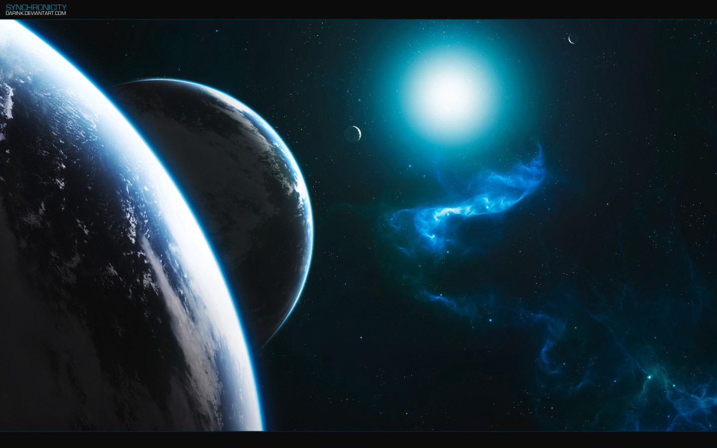
Original Size: 2000px x 2200pxThought I would enter a piece I have been tinkering with for a while. Not very good at naming things, so I thought the name of the comp would be good enough

Took me 6 houra on and off for a few days.
Enjoy!
EDIT: I was getting a few people telling me there were a few things wrong with it. I saw these and decided I needed to re-do it. So here it is, versions two. Better textures, lighting and composition.
Related content






Comments: 42


First, this is the first critique I ever wrote. But I think this is one of your best pieces and also, I want to say thank you for your critique in my way e.deviantart.net/emoticons/w/w… " width="15" height="15" alt="

I really love the light here. It's really shiny and you've got a nice kind of lens effect too.
About the starfield.... I love it and at the same time it's one thing I dont like about it. I really like that there are so many stars, but there are too many^^ Because in the parts where the bigger stars are, the picture seems low quality because of those many white points. Also, I would be nice to see some more bigger stars which would make the whole piece more interesting and would add some details to it (since you don't have a nebula in this piece, you have to make details otherwise).
The light on the two smaller planets is great. But the close up one looks too flat, maybe because its just a "line". You could liquify it to make it more round like I did in my "freya" piece or something. e.deviantart.net/emoticons/b/b… " width="15" height="15" alt="

The texture of the big round planet is too varied for me. Because of the many light and dark parts of the texture it seems low quality too, since it really isn't^^
But the whole piece fits the title perfectly, better than my pieces (which isn't really hard e.deviantart.net/emoticons/w/w… " width="15" height="15" alt="
e.deviantart.net/emoticons/w/w… " width="15" height="15" alt="
Hope you liked my first critique and sorry for my really bad english, I'm still learning e.deviantart.net/emoticons/w/w… " width="15" height="15" alt="
👍: 0 ⏩: 1

Thankyou for the balanced and fair critique.
I do feel that sometimes I may overdo the starfield, but as you said it is because of the lack of nebulae (mainly because I am terrible at making them). I also agree that it needs some brighter stars to add an interest to the piece.
For the foreground planet, I am a little disappointed at how it turned out, but in future I will round it a bit more.
I am not too sure about the texture of the planet, I used some rust and ground textures I have taken over the years. I like the high contrast in textures, but it is good to see someone else expressing an opinion
Thanks for writing it!

👍: 0 ⏩: 0


This great artwork is nominated for our SFA-2011 [link] front cover. Please provide a matching piece for the back cover as well. Thanks and good luck in the contest!
👍: 0 ⏩: 0

did you do that extremely detailed sun flare by hand?!!
👍: 0 ⏩: 1
Nope. I made it myself using the tools of Photoshop.
👍: 0 ⏩: 1


Now THAT looks great 
👍: 0 ⏩: 1

I never saw the first one, but this version looks great!

👍: 0 ⏩: 1
Thanks. The original was somewhat similar, but I feel this one is more successful, and looks nicer.
👍: 0 ⏩: 0

An awesome piece once again Sos! wow! I'm terribly impressed buddy!
👍: 0 ⏩: 1
Very nice work there ! 

👍: 0 ⏩: 1
Thanks for commenting. I think in a previous comment, the flat planet has been brought up. I was trying to pull it off as being extremely close to the planet so the horizon would look flat, but as you have noted it is not as successful as I had hoped, like you did with your "Warm Sunshine" piece. I also opted for this method because I didn't have a planet that big to give a convincing sphere shape. I am not sure what you mean by lacking in details. I used some rust images that I took and combined them and coloured them in Photoshop to make it look like a varied planet texture. Bear in mind that not all planets are like our planet Earth, and that Earth-like planets are very hard to do well. Though I know my textures need work, it's the most important feature of a spaceart piece. As for lighting, I like to take a bit of artistic license when making these, I don't make photo-realistic or physics-realistic pieces. In this case, I wanted to show off the texture a bit more. Not sure about the rings, I tried to get them as good as possible.
Thanks for the critique.
👍: 0 ⏩: 1
Lol, fair enough. Your very welcome
By lacking in details I mean stuff like Inner and Outer Glows, Bevel and Emboss, Color and Gradient Overlays, lighting effects..you know..the things that you need to add and adjust to make the image look pleasing to the eye, makes you look at it for hours.. like you did here [link] and here[link] ?
👍: 0 ⏩: 0

That's really nice. The flare and the starfield are awesome.
👍: 0 ⏩: 1
Cheers man, I got a bit of my flare inspiration from you
👍: 0 ⏩: 1

wow that looks amazing
how did u make that rainbow lens flair?
👍: 0 ⏩: 1
I used a program called Knoll Light Factory. That rainbow is called a Chroma Fan.
👍: 0 ⏩: 1
thanks mate
i just downloaded it and its great!
👍: 0 ⏩: 0

the sun and the flare are really beautiful. You did an excellent job here.
👍: 0 ⏩: 1

Good job man! you may need to redo the shadow of the close up planet!
👍: 0 ⏩: 1
So how should I orgaise my shadows lol
👍: 0 ⏩: 1
Clearly you put shadows in some areas! I dunno why does it look perfect to you

👍: 0 ⏩: 1
Actually I used a texture made from rust photos I have taken. I then made a black circle and blurred it, changed to 85% opacity = shadow
I didn't try and put it in different areas at all, it's probably the texture.
👍: 0 ⏩: 1
Wait, are you talking about the planet in the midground, or the one closest to the "camera"?
👍: 0 ⏩: 1
Ah, yeah I think that's the texture. I might re-do it later on. Thanks.
👍: 0 ⏩: 1

