HOME | DD
 ThomasSedgewick — Smashed Rubik's Cube
by-nc-nd
ThomasSedgewick — Smashed Rubik's Cube
by-nc-nd

Published: 2012-01-18 20:50:39 +0000 UTC; Views: 2778; Favourites: 7; Downloads: 27
Redirect to original
Description
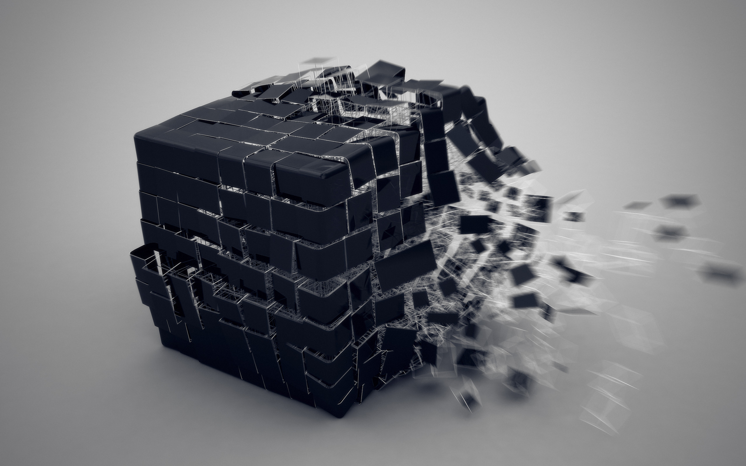
Produced for a presentation based around Rubik's Cube, deadline was less than a week so you have to appreciate that it might not be perfect!And to anybody in the know, it's the original Type C!
Related content




Comments: 7

pretty sweet. you did a great job. i could see more action going into this but like you said you had a deadline.
👍: 0 ⏩: 1

Thanks!
What kind of action do you want to see? More pieces in the air, more movement in the pieces on the surface or even some motion blur on the hammer?
I probably won't be repeating it but it's always interesting to know what people want improving.
P.S You drawings are amazing.
👍: 0 ⏩: 2
Thanks!
Well I was thinking it could be more lively. As it is it looks posed (well duh, because it is). But little things can make a big difference. For example, the hand could make a tighter grip, adding more force to the action and making the action more believable to the viewer -- as opposed to its casual grasp. It's nice with the pieces flying in the air (and motion blur), however I noticed it looks kind of flat; the suspended pieces are all on the same horizontal plane. Maybe a piece or two with greater verticality could do some good. One last thing, the front to back depth space of the photograph is good but my eye is caught by the foreground pieces; they're turned away not showing their stickers. To me this deadens that portion of the photograph, but in some ways it's not necessarily a bad thing.
So yea, I'm not saying one way is a right way of course. Just giving my genuine thoughts which I'm sure is what you wanted. I'm also a photographer by the way, though I have never shot posed studio stuff before.
Oh, and about blur on the hammer/arm, I don't think it really needs it, but it's definitely worth experimenting with.
👍: 0 ⏩: 1
Thanks for a genuinely insightful review, it's more than I get from some of my fellow photography students!
I definitely agree with your comment on the grip, I'm sure I have some shots with a tighter grip but this I found to be the best angle. I am going to have to pay attention to these kind of details more for next time.
I honestly didn't notice the stickers being turned away! I actually just dropped all the pieces to get a more natural spread, I guess I need to make a compromise between natural looks and pure aesthetic appeal.
Again, thank you for some brilliant comments.
👍: 0 ⏩: 1
Your welcome! I'm usually one of those guys that just says "cool" or "awesome," haha. I'm glad I could be helpful. I like to think I have a good eye for things.
And I know what you mean about compromising between natural and forced aesthetics. Sometimes as a photographer you have to intervene, especially in studio settings.
👍: 0 ⏩: 0

Looks really sweet. I think you could had achieved more action from the shot, by simply holding the hammer more firmly in your hand. Right now it looks like it's just resting in your hand.
I would go outside and try to hit the hammer on the ground while taking the pictures. Then you would get more clear idea on how to hold the grip. But nonetheless I like the picture... +fav from here

👍: 0 ⏩: 1
That is a great tip and I will keep in in mind for any similar things in the studio, or I could get a better model!
👍: 0 ⏩: 0