HOME | DD
 Torsten85 — Logotype_ener-g

Published: 2007-11-21 19:59:11 +0000 UTC; Views: 1823; Favourites: 8; Downloads: 56
Redirect to original
Description
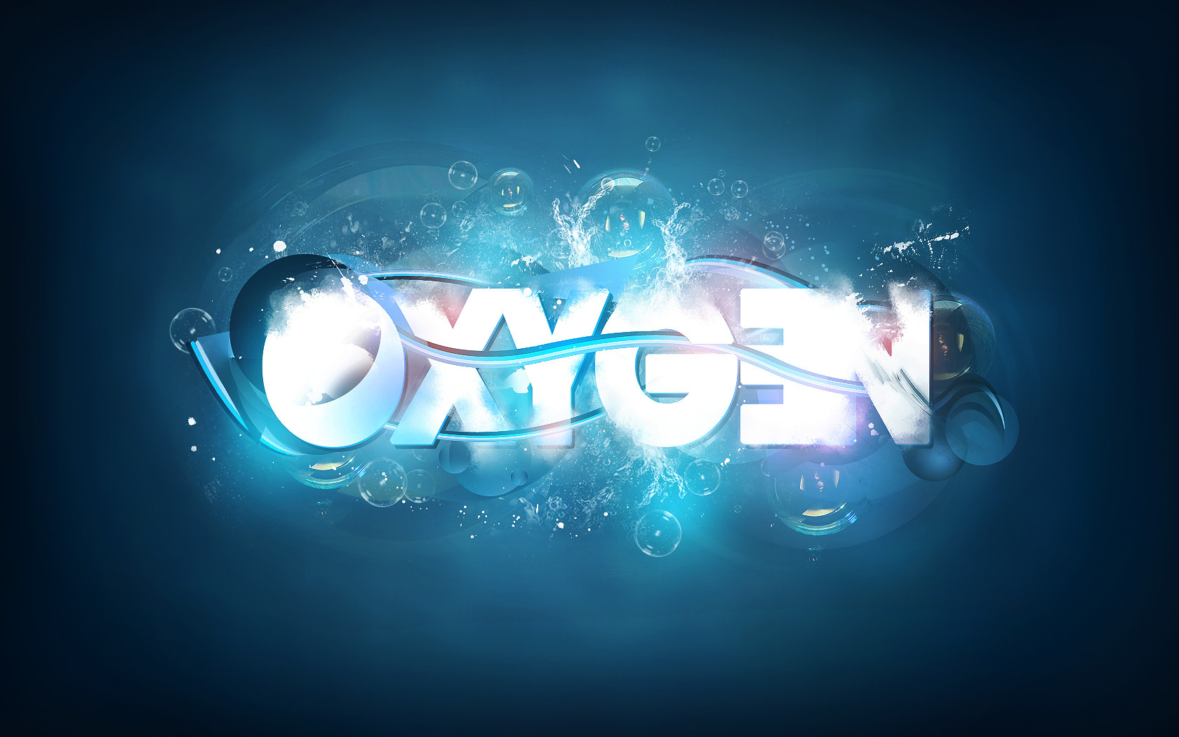
4th Logotype...for an energydrink brand...
If you have some ideas for improvement then let me know!!
Comments and
 are very welcome!!
 greetings from Germany...Torsten
Related content




Comments: 32


Very nice. Lovin' the play with movement and sort of a wispy, flame-ish effect on the letters.
It feels maybe a little overdone in some places though? The curves on the E, while nice at first, get a little crazy, and the curve effect applied to what I'm guessing is an exclamation point makes it look more like a question mark, to me (Ener-G? Why yes...).
The E also creates a problem for the secondary text ("never get tired again"), as it intrudes too far below the baseline, causing there to be a rather unsettling gaping hole between "never get" and "tired again".
Maybe play down the curves on the E a little? Make it a little more subtle (ever so slightly), especially around the bottom, and straighten out the exclamation point a little, and I think you'd have yourself an excellent logotype indeedy
I'm in a critique-y mood. Sorry if I'm annoying you
👍: 0 ⏩: 0

nice idea - but hard to read 

👍: 0 ⏩: 1

hehe thx a lot for ur support man1!
👍: 0 ⏩: 0


2nd is better. Nice work. I like colors in 2 version

👍: 0 ⏩: 1
thx a lot mate!! Glad about ur support!!
👍: 0 ⏩: 0

iwie siehts für mich etwas zu lang aus, so nicht wirklich zusammenhängend , alles andere ist echt nice
👍: 0 ⏩: 1
hmm...soll ja aufen energy drink...dafuer denk ich ist es net zu lang xD aber vielen dank!!
👍: 0 ⏩: 0

nice!
greetz BriaN
👍: 0 ⏩: 1
hehehehehehehe...danke dir vielmals!!
👍: 0 ⏩: 0

always something great from you! great work again bro
👍: 0 ⏩: 1


sieht gut aus
würde ich aus dem logo lesen^^
👍: 0 ⏩: 1

Bottom logo spacing looks further on the E then the top one which looks better IMO.
Both are still too difficult to read but I like the concept.
👍: 0 ⏩: 1
Thx a lot for ur support on all my logos!! THX BRO!!
👍: 0 ⏩: 0

das untere is bombe, die E's sind hamma!
finds perfekt für nen energy-drink!
diesma bekommste nen fav^^
👍: 0 ⏩: 1